Overlay Descriptions
in this lesson
Overlays cover a wide range of functions. They are more generally described in the chapter introduction. Overlays are divided into five primary categories
Know what you are seeking? Jump straight to the overlay by name:
- Terrain
- Contours
- Slope Angle Shading
- Geology
- Route Discovery
- MapBuilder Overlay
- Motor Vehicle MVUM
- Recreation
- Shared Maps
- MapBuilder Features
- Ownership
- Public Lands
- Parcel Data
- Public Safety
- Aircraft
- Structures
- Fire History
- Fire Activity
- Cell Coverage
- Your Data
- Your Maps
- Your Tracks
Terrain
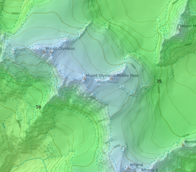
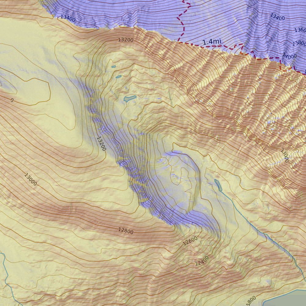
Contours
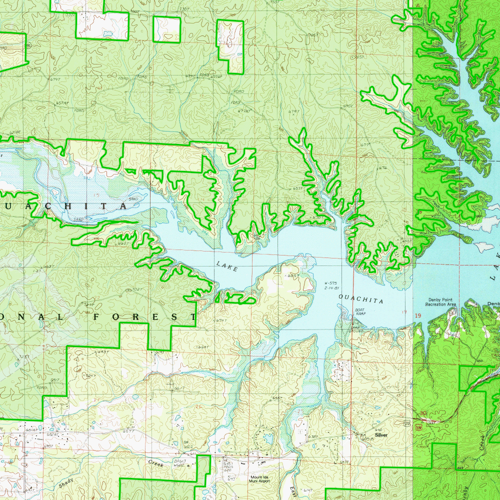
The contours overlay is based on DEM, or Digital Elevation Model, data sets. This overlay will help you add topographic information to an otherwise “flat” map such as aerial imagery or a street map. Contours are offered at Mixed, 40 ft, 10 ft, 20 m, and 5 m intervals.
You can choose change the spacing of contour lines in the dropdown menu. For this overlay, the color of the lines is not editable; however Desktop, and Team accounts can create a custom contours overlay using the custom MapBuilder layer function, and choose the color there.
This overlay is available for download for offline use in the mobile app.
Slope Angle Shading
This purely visual overlay uses a color scheme for depicting slope angle. The color scheme can be set to fixed or gradient using the dropdown menu.
Much of the area covering the United States now incorporates high-resolution LIDAR data from the USGS's 3DEP program. This provides significantly higher resolution than past data, even allowing you to identify trails from relief shading. An interactive map showing high resolution coverage can be found here. High resolution offline downloads are larger in size than previous elevation data so be aware of that when downloading for offline use.
Slope angle shading should be used in conjunction with your backcountry travel and terrain assessment tools. Do not rely on it for absolute truth.
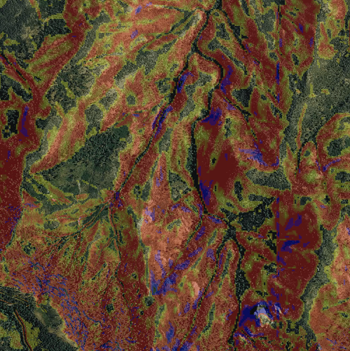
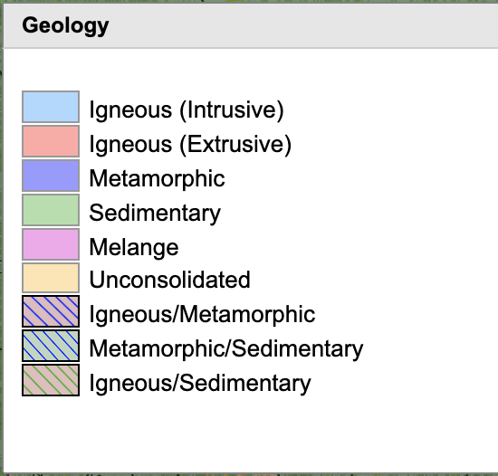
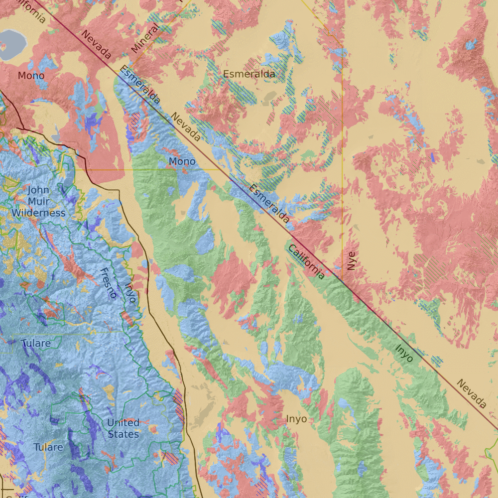
Geology
New as of November 2020, this layer shows the prominent geological forrmation type. As you zoom in, it will show the label for the type of substrate. This data is sourced from the USGS. You can find a similar map based on the same data with more details here.
The layer comes with this key, which you can also open inside the map viewer by clicking the link below the map overlay checkbox.

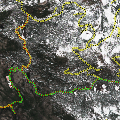
Route Discovery
MapBuilder Overlay
Described in detail at the start of this chapter, the MapBuilder Overlay displays roads, trails, hydrology and other features from the MapBuilder Topo base layer. This overlay will add context to aerial images or other base layers that do not call out roads and trails.
Trail and road data comes from OpenStreetMap. CalTopo brings in new data from OSM several times a year. To see the most recent import date, please visit the Map Layer Data Updates page.
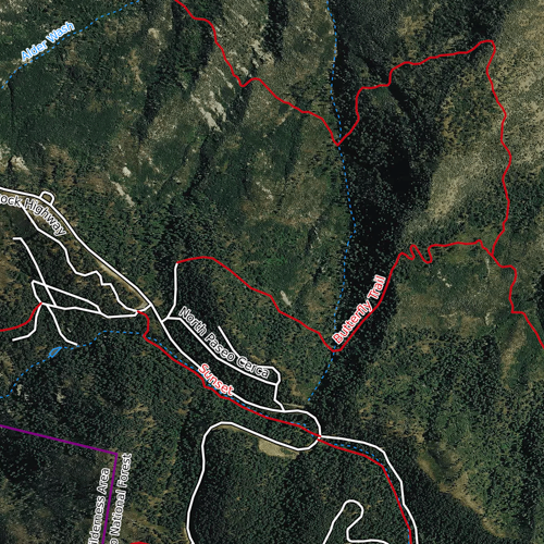
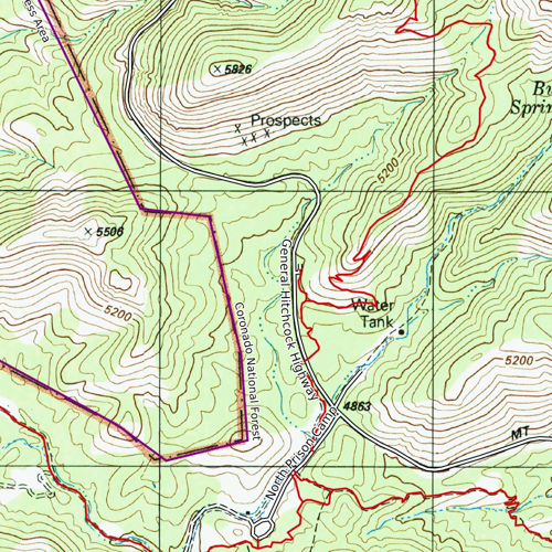
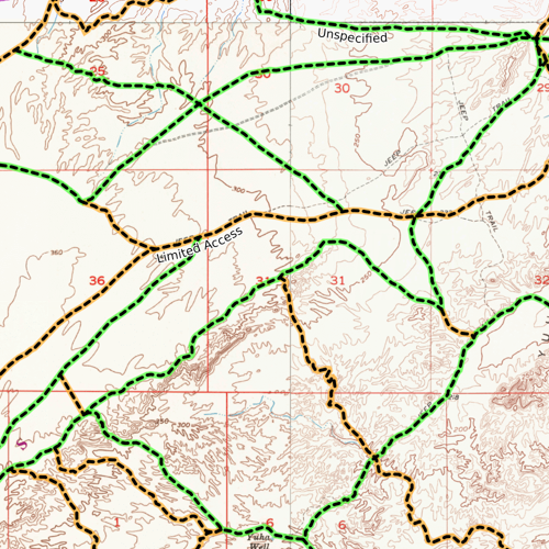
Motor Vehicle Use Maps (MVUM)
The MVUM overlay shows motor vehicle route designations and types. This overlay incorporates data from multiple sources, including USFS and BLM. It is updated once yearly from all incorporated sources to the extent that new data is available; however we cannot guarantee data accuracy or that road conditions will be exactly as detailed in this layer.
CalTopo brings in new MVUM data several times a year. To see the most recent import date, please visit the Map Layer Data Updates page.
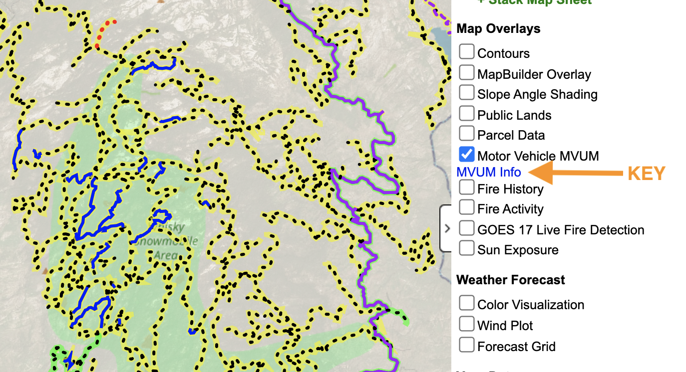
Find the key by clicking the blue link for MVUM Info below the checkbox.
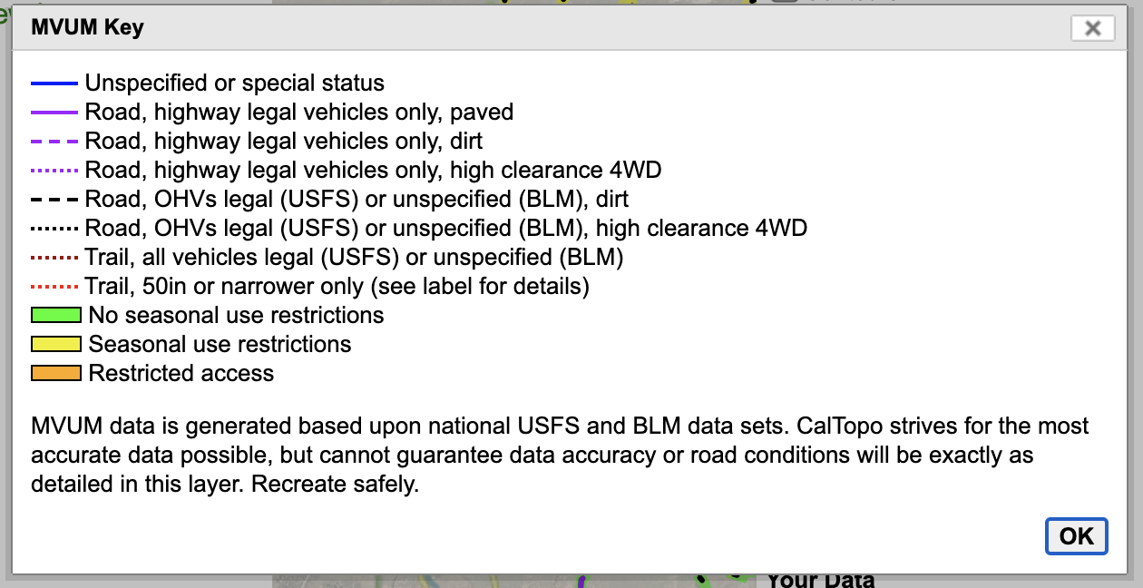
The MVUM legend.
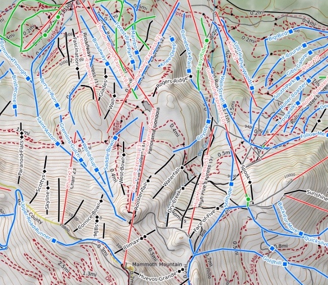
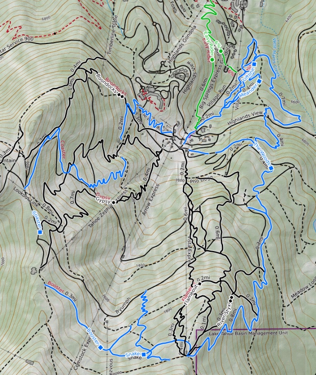
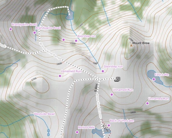
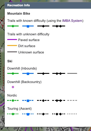
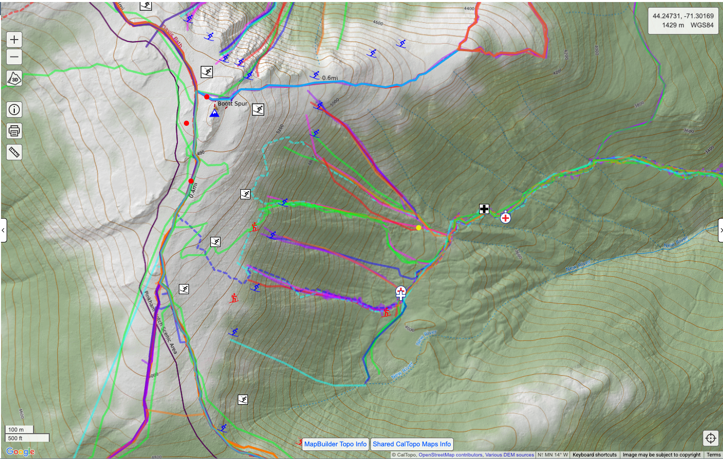
Recreation
This overlay displays ski lines and mountain bike trails from OpenStreetMap (OSM). Use the dropdown menu to choose between ski or mountain bike data.
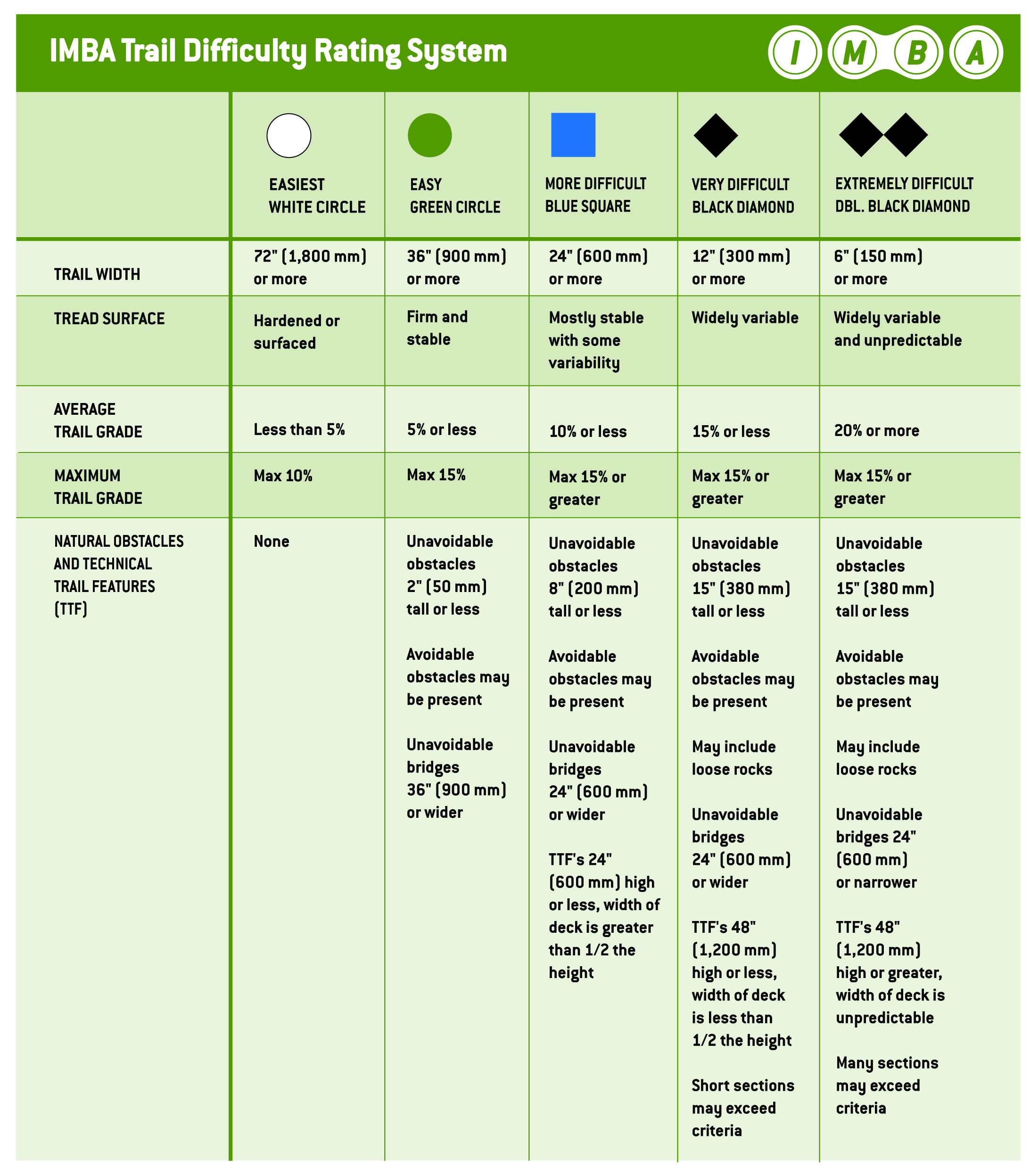
Click on the Recreation Key at the bottom of the map viewer to display a legend for the overlay. Mountain bike trails with known difficulty are color coded using the IMBA system. If the difficulty is unknown, trails are distinguished by surface type. Ski lines are identified by type (downhill, nordic, or touring) and difficulty. Downhill ski lines are further separated into in-bounds ski lines and backcountry ski areas. It is important to note that downhill backcountry ski areas are represented by a dot in the general area rather than a distinct run, since these areas are often less clearly defined than in-bounds ski lines at a resort.
Don’t see your favorite ski line or mountain bike trail? Then add it to OpenStreetMap (OSM)! OSM is a crowdsourced website where users can add and update trail information. You can edit the map itself on OSM and then you’ll see the updates in any CalTopo layer that uses OSM (including Recreation) after our next OSM import, which typically occurs a few times a year. To see the most recent OSM import date, please visit the Map Layer Data Updates page.
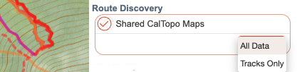
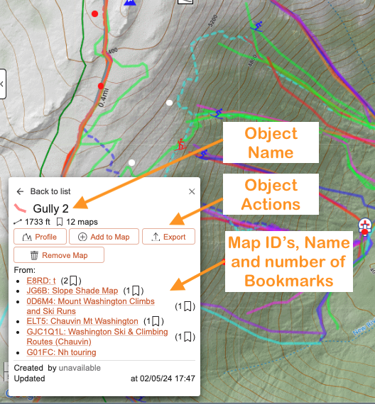
Shared Maps
This overlay displays objects from all public maps saved in CalTopo. Lines are displayed in different colors to help distinguish between objects; the colors themselves do not convey any specific meaning. Markers use the same icons as on the public maps they originate from. Line style is used to distinguish recorded tracks from manually drawn lines: recorded tracks that include timestamps are shown as dashed lines, while lines drawn on the original map are shown as solid lines.
Clicking an overlay object opens the details panel, which includes:
- Map name and ID – shown as a link that opens the map in a new tab.
- Distance and time/date recorded – displayed as applicable for the object.
- Number of bookmarks – the number of users who have bookmarked the map, providing a general indication of its popularity.
- Add to current map – add only that object to your map.
- Export – export the object as a file.
- Elevation profile – view an elevation profile for lines and tracks.
By default, all public map objects within the current map view are displayed. Use the dropdown menu to limit the display to tracks only.
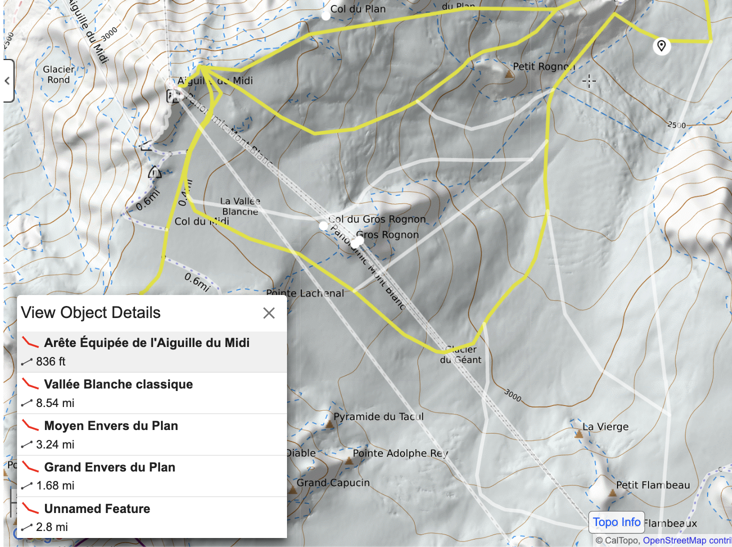
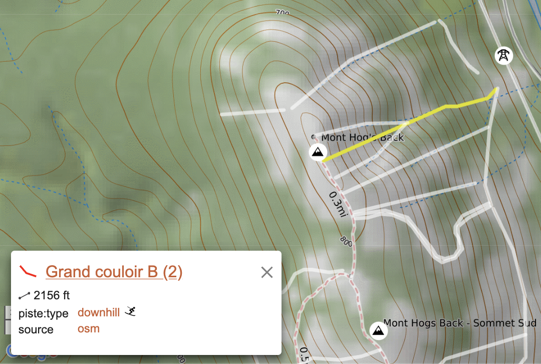
MapBuilder Features
Turn on this overlay to get more information about features included in the MapBuilder layers such as roads, trails and peak names. Hovering over each feature will highlight them; clicking on them will tell you exactly what it is. Clicking on the name of the feature will open up a new tab with further information from an outside website on that particular feature.
Ownership
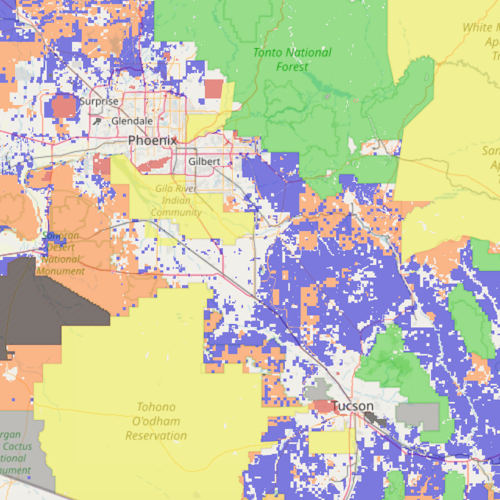
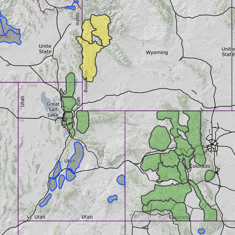
Public Lands
The public lands overlay delineates the United States land management agency (USFS, NPS, BLM, State, local, or private) for a given area, employing a color scheme. The data originates from the Surface Management Agency. It's worth noting that in certain regions, the boundaries may appear inaccurate. The Surface Management Agency relies on Proclamation Boundaries, which, in some instances, do not align with the current boundaries, leading to encroachments onto private or State land, particularly inholdings.
You are responsible for determining the regulations for travel and use when entering lands managed by each particular owner or manager.
Formerly named "Land Management", this overlay has been renamed to clarify the coverage.
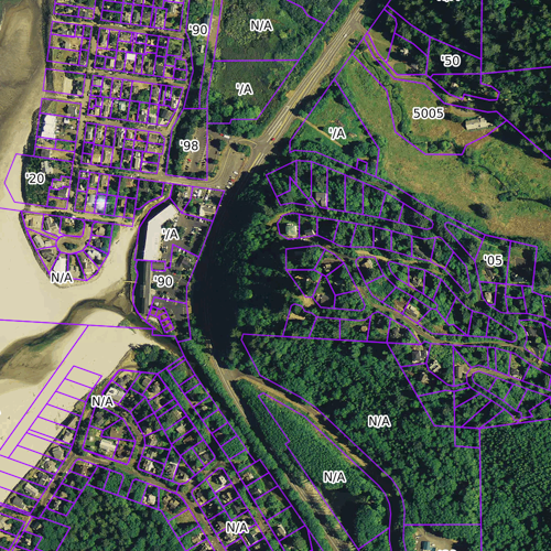
Parcel Data
This overlay is restricted to Pro and higher subscription levels. It is then also available for offline use in the app.
The Parcel Data overlay shows property boundaries and addresses for the majority of the United States, as well as ownership information for many of those properties. A dropdown menu allows you to choose if the layer displays ownership data, address number, or boundaries only.
Parcel data is licensed from ReGrid, which is still growing and does not have ownership information for all counties yet. An interactive map showing coverage for ownership can be found here. Red areas indicate that we have the parcel boundary and site address only, while blue areas indicate ownership information is available in addition to the boundary and address info.
CalTopo brings in new data from ReGrid several times a year. To see the most recent import date, please visit the Map Layer Data Updates page.
Conditions
Cumulative Forecast
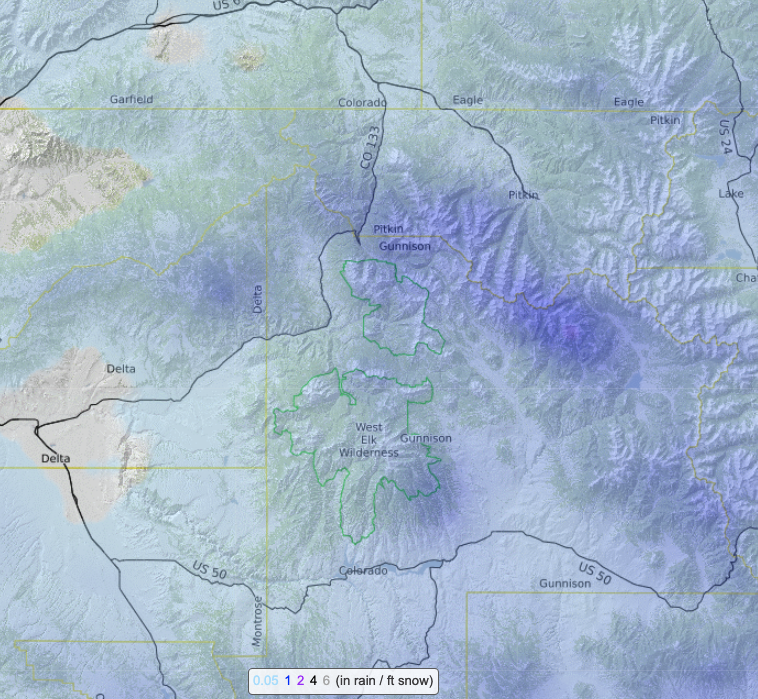
With this overlay you can view color-coded forecast representations across a wide area. It combines many of the weather forecasting tools into one overlay. Use the dropdown menu to select between forecasted temperature, precipitation, snowfall, wind speed and wind gusts, and the other menu to set the time frame. Data is based on the National Weather Service (NWS) forecast grids and uses a color gradient for easy and quick visualization. Keys for the color gradient appear in the bottom of the map viewer.
The weather grid overlay has also been rolled into the weather shading overlay. The numerical forecast for the center point of each 2.5 km NWS forecast grid is now displayed on top of the color gradient at higher zoom levels. Please note that these numbers are not interactive; you must right click on that point and then select NOAA Forecast from the dialog that appears in order to display a forecast for that area.
Weather Stations
This overlay is available to Pro and higher subscription levels
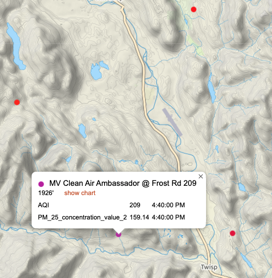
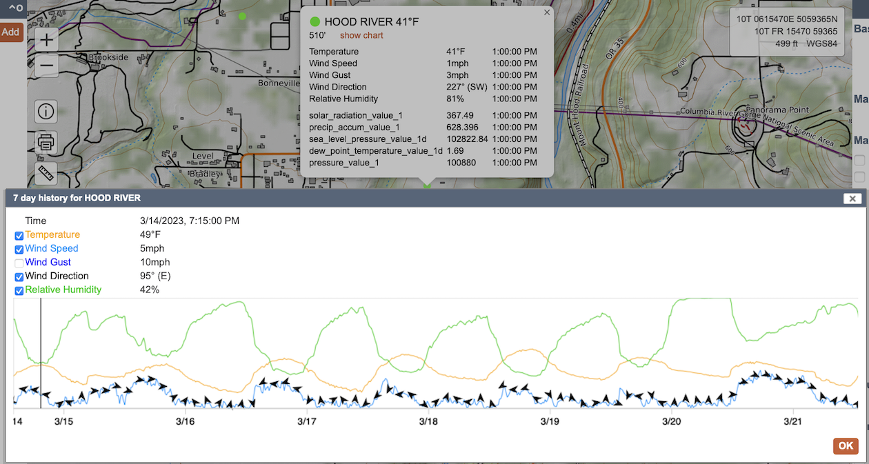
This overlay combines weather stations, Snotel sites, USGS water gauges and more all in one place. Data comes from Synoptic, a company that works directly with both public and private data owners to aggregate large networks of sensors into one database. Use the dropdown menu to choose between temperature, wind, water, snowpack and air quality sensors. Sites with the selected type of sensor will appear as dots on the map. Clicking on a sensor will bring up a dialog with select data from the sensor as well as a link to display a customizable and interactive sensor history from the last 7 days.
Dots for temperature, wind and air quality are colored to reflect their current readings. Click the Weather Info button that appears at the bottom of the map viewer to display a color key for each of these types of sensors.
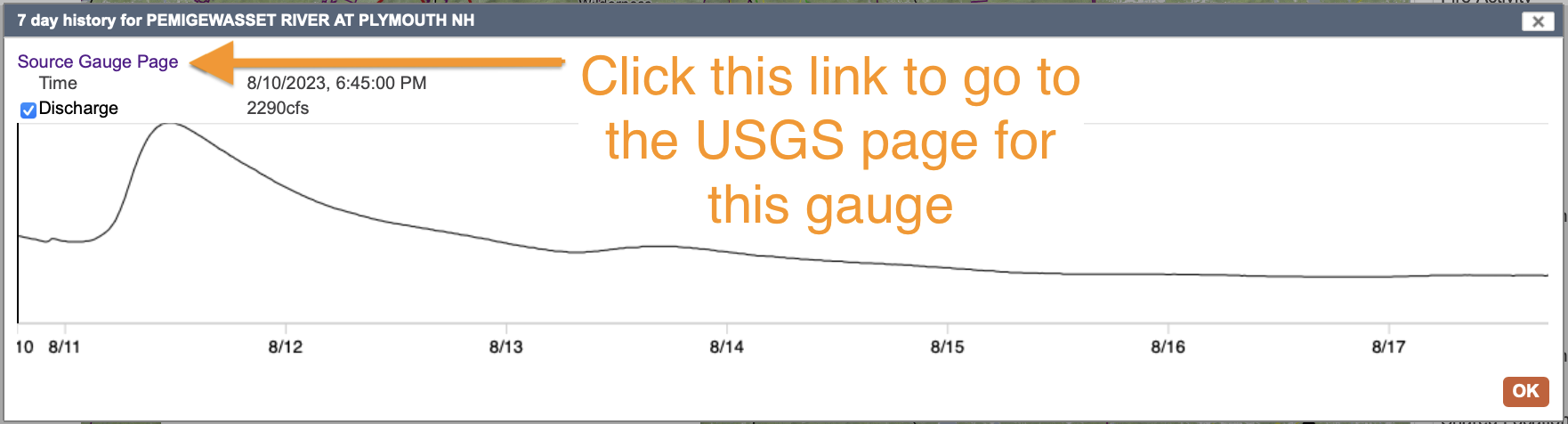
If you choose water to get the information about stream and river flow and you click show chart, there will be another link in the chart's dialog box. In the upper left of the chart's box you'll see Source Gauge Page, by clicking that you'll be taken to the USGS page for that gauge.
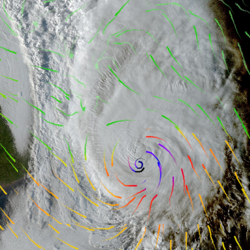
Wind Plot
A user favorite, the wind plot displays arrows showing current or forecasted direction and average wind speed or gusts for specific points in time. View predictions at 3 hour intervals up to 12 hours and then 6 hour intervals up to 36 hours.
Color corresponds to speed. The same color chart as the Wind Speed color visualization overlay is used to indicate speed with short lines tracing direction.
The thicker end of the short line indicates which direction the prevailing wind is blowing (think of a comet where the head of the comet is the direction of travel). The length of the lines has no meaning.
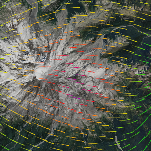
Sun Exposure
The sun exposure overlay uses a blue-yellow-red spectrum where blue is completely shaded, red represents the maximum sunlight a slope can have on that day and yellow is 50%. Coloration is based on how directly the sun shines on a slope: glancing light counts less than direct full-on illumination. You can specify date and time or get an average across a day or month using the menus.
On the web and in the mobile app this overlay reflects the time zone of your browser and it can not be adjusted to a different time zone at this time.
Mt. Rainier 7:30 am Sun Exposure in October.
Mt. Rainier 8:00 am Sun Exposure in October.
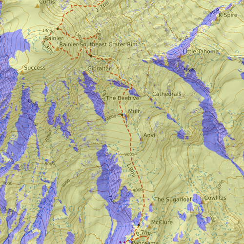
Mt. Rainier 8:00 am Sun Exposure in July.
This overlay takes a significant amount of processing power and can slow the application or cause it to hang, especially if zoomed out to cover a wide geographical area.
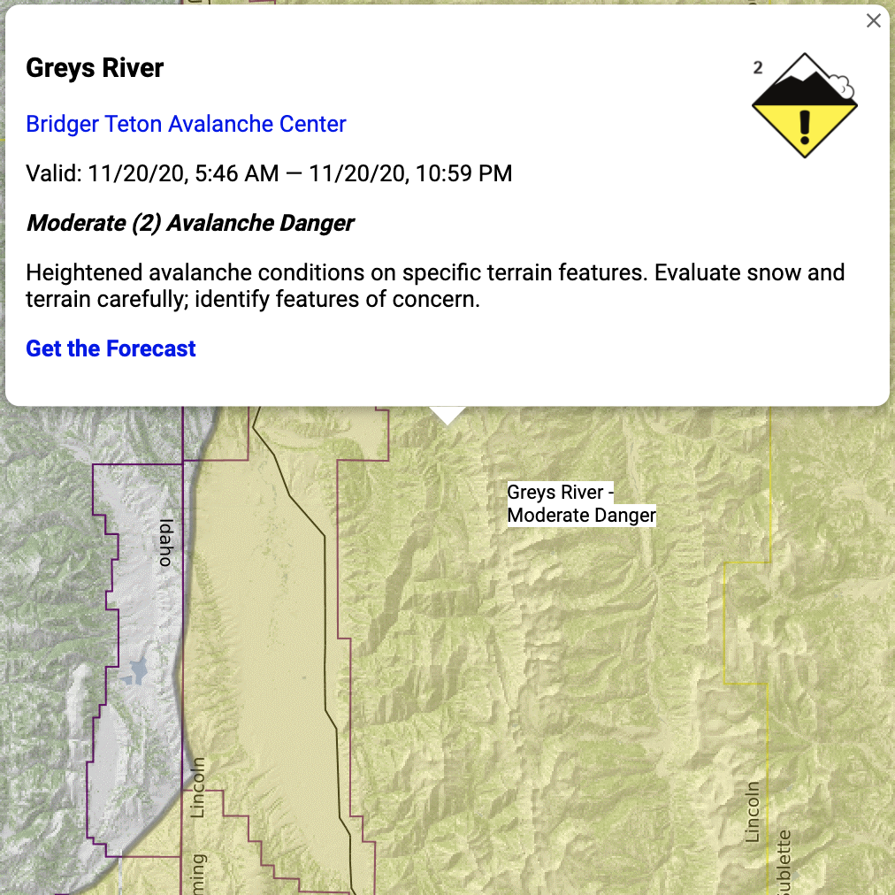
Avy Forecast
In close partnership with the American Avalanche Association, the USDA Forest Service National Avalanche Center, and Avalanche Canada, CalTopo now includes avalanche forecasting for the US and Canada.
These forecasts are delivered in real time from forecasting organizations and displayed on the Avalanche Forecast layer in both the app and on the web. We focused a great deal on ensuring accurate and up to date forecast information is shown. For obvious reasons this layer requires internet connectivity.
When you activate the overlay to the map viewer, it will fade, then disappear as you zoom in. This is intentional.
Click on any forecast area to pull up a box with the local message and forecast. Follow the link at the bottom of this box to the full forecast page for additional information.
We strongly encourage users to click on the forecast to get further forecast details and discussion. We also recommend that all backcountry travelers spend time educating themselves on winter travel. The American Avalanche Associate and Avalanche Canada both provide excellent educational resources for you to do so!
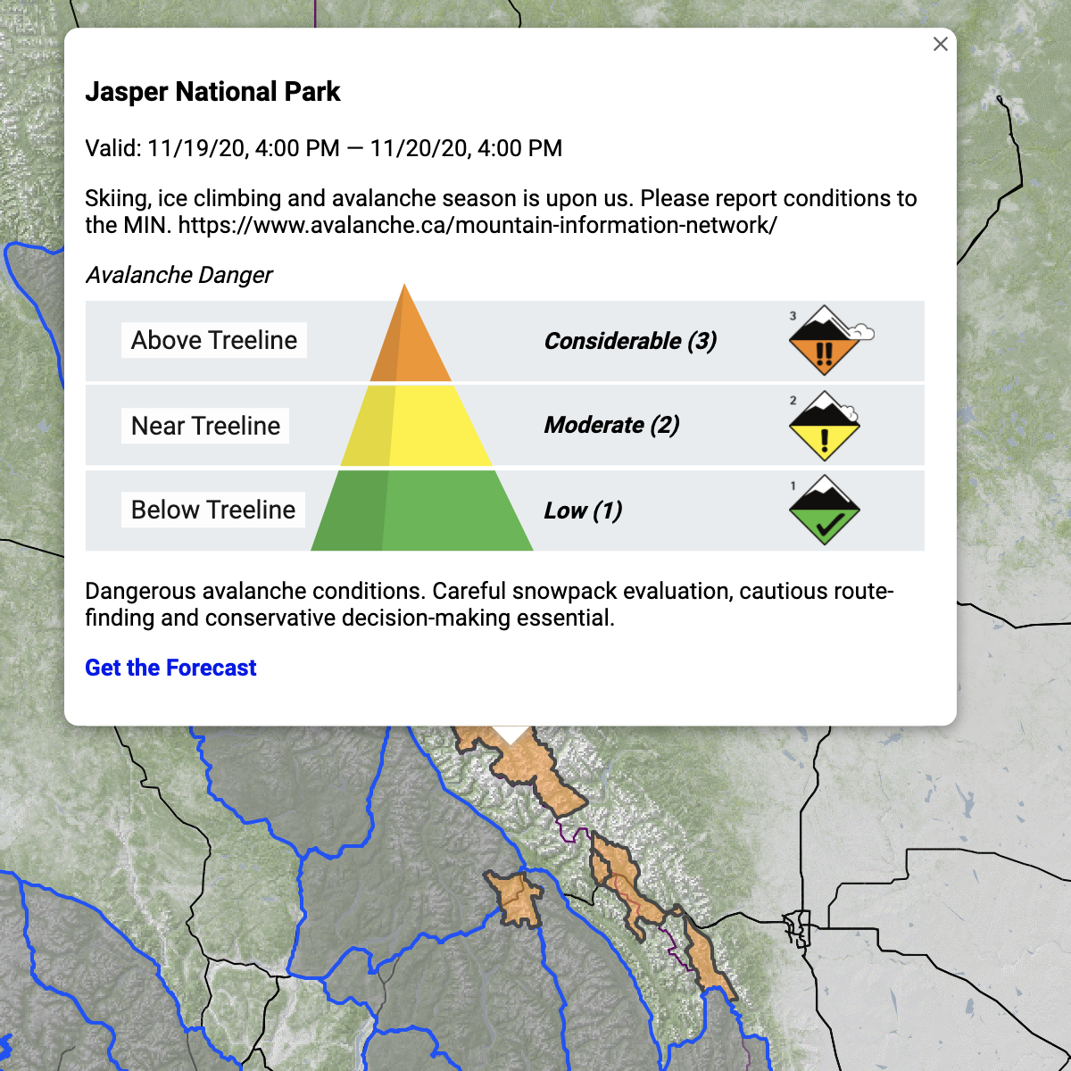
The forecast will always include the name of the area, the dates and times the forecast is valid, a status for the rating, and a link to the forecast page for more information. It may also include a short description, and relevant graphics as you see here.
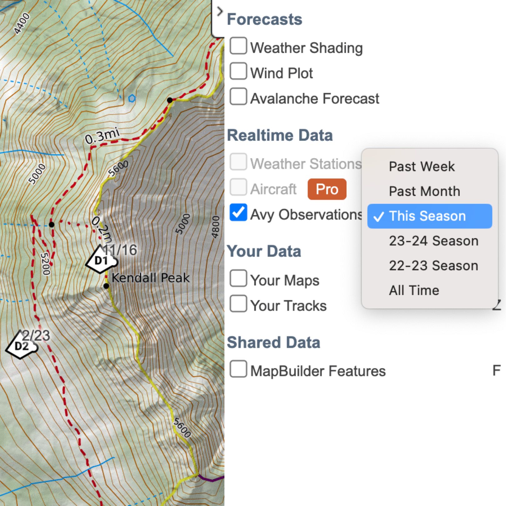
Avy Observations
This overlay allows you to display reported avalanche occurrences from participating avalanche forecast centers directly in your map. Developed in partnership with the USDA Forest Service National Avalanche Center (NAC) and the American Avalanche Association, the data for this overlay comes from the Avalanche Forecast Platform (AFP) on avalanche.org.
The Avy Observations overlay is updated once per hour. Use the dropdown menu next to the overlay name to limit reports of avalanches displayed to the past week, past month, this season, another season (such as the 2023-2024 season), or all time. Occurrences are represented by an avalanche icon that includes the location of the reports as indicated by the position of the icon on the map, the destructive force of the avalanche based on the D-scale, and the date of the report.
Click or tap on an avalanche icon to display a dialog with further information about that occurrence, including the coordinates, number of avalanches (if multiple avalanches were included in the report), relative size of the avalanche based on the R-scale, avalanche type and trigger, aspect, elevation, and/or whether anyone was caught, injured, or killed in the avalanche if available and applicable to the particular report. Click or tap on the “Avalanche Details” link at the bottom of the dialog to view the full report on the avalanche forecast center’s website.
Click or tap on “Avy Observations Info” at the bottom of the map viewer for a list of participating avalanche forecast centers.

Public Safety
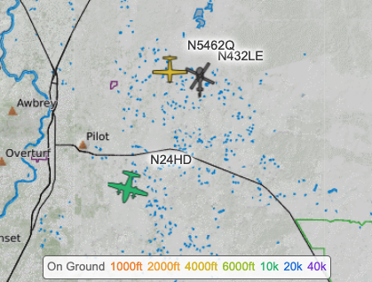
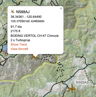
Aircraft
This overlay is available to Pro and higher subscription levels.
This overlay displays publicly available unfiltered flight data from ADS-B Exchange. Aircraft appear as an icon indicating the type of aircraft along with the aircraft identifier. The direction of the icon indicates the aircraft's current direction of travel and the color indicates its elevation. A key for the elevation color appears at the bottom of the map viewer. Clicking on an aircraft icon brings up a dialog that displays information about the aircraft and flight, including its current coordinates, speed, elevation and aircraft type. There are options to show or hide the aircraft's track as well as view aircraft details on the ADS-B Exchange website.
If you have a saved map open when you click the aircraft, you will get a 3rd option, Record to Map. By choosing that the aircraft will draw a line as it flies. If all you are interested in is a few aircraft you can record the ones of interest and uncheck the Aircraft overlay and only the aircraft you are interested in will be visible as a drawn line.
Use the dropdown menu to filter which types of aircraft are displayed, such as low flying, helicopters, jets or no jets.
Be aware that in order for an aircraft to appear on the Aircraft overlay, it has to have a ADS-B transceiver and the transceiver must be on and transmitting. There also must be sufficient receivers in the area that can receive the transceiver's transmission and relay it to the internet. Aircraft may not show up in the overlay for a number of reasons including (but not limited to): the aircraft is on the ground and turned off, the aircraft is in an area without sufficient receivers or the aircraft is flying too low.
Structures
Meanwhile, the Strucutres overlay depicts known structures as polygons at high zoom levels and as dots at low zoom levels.
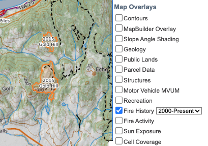
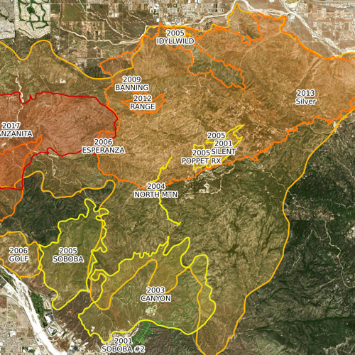
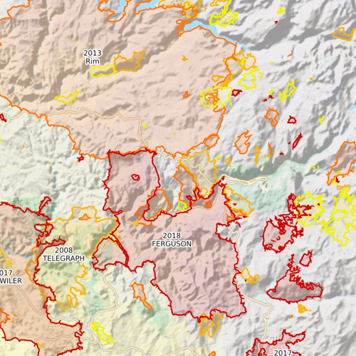
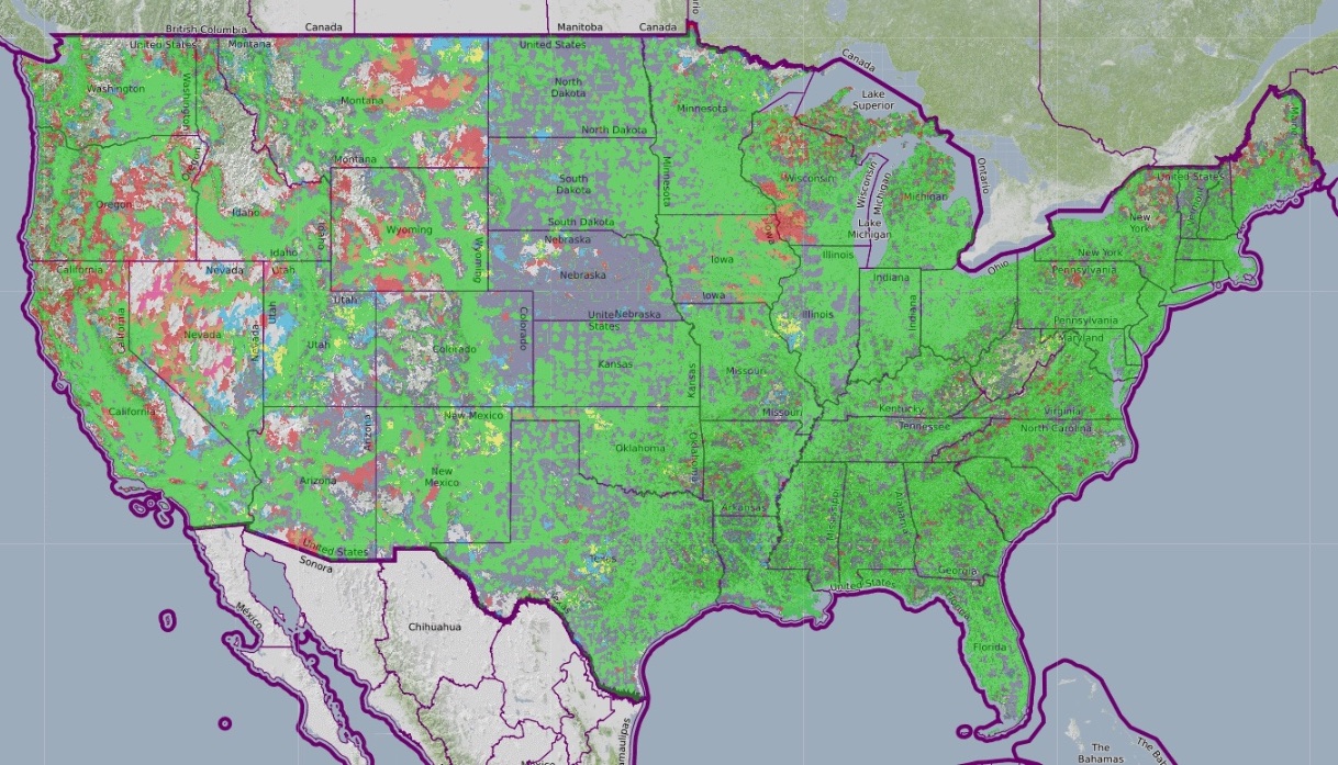
Fire History
This layer depicts wildfire perimeters in the US. You can use the dropdown to choose data either since 2000 or since 1900. Fires are color-coded by year along a yellow-red spectrum. The year and incident name for all fires are shown, although you may need to zoom in for smaller fires. Please be aware that it can be hard to distinguish which label belongs to which fire in some areas with overlapping fire perimeters.
Fire History data comes from the NIFC. To see the most recent import date, please visit the Map Layer Data Updates page.
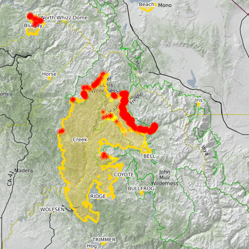
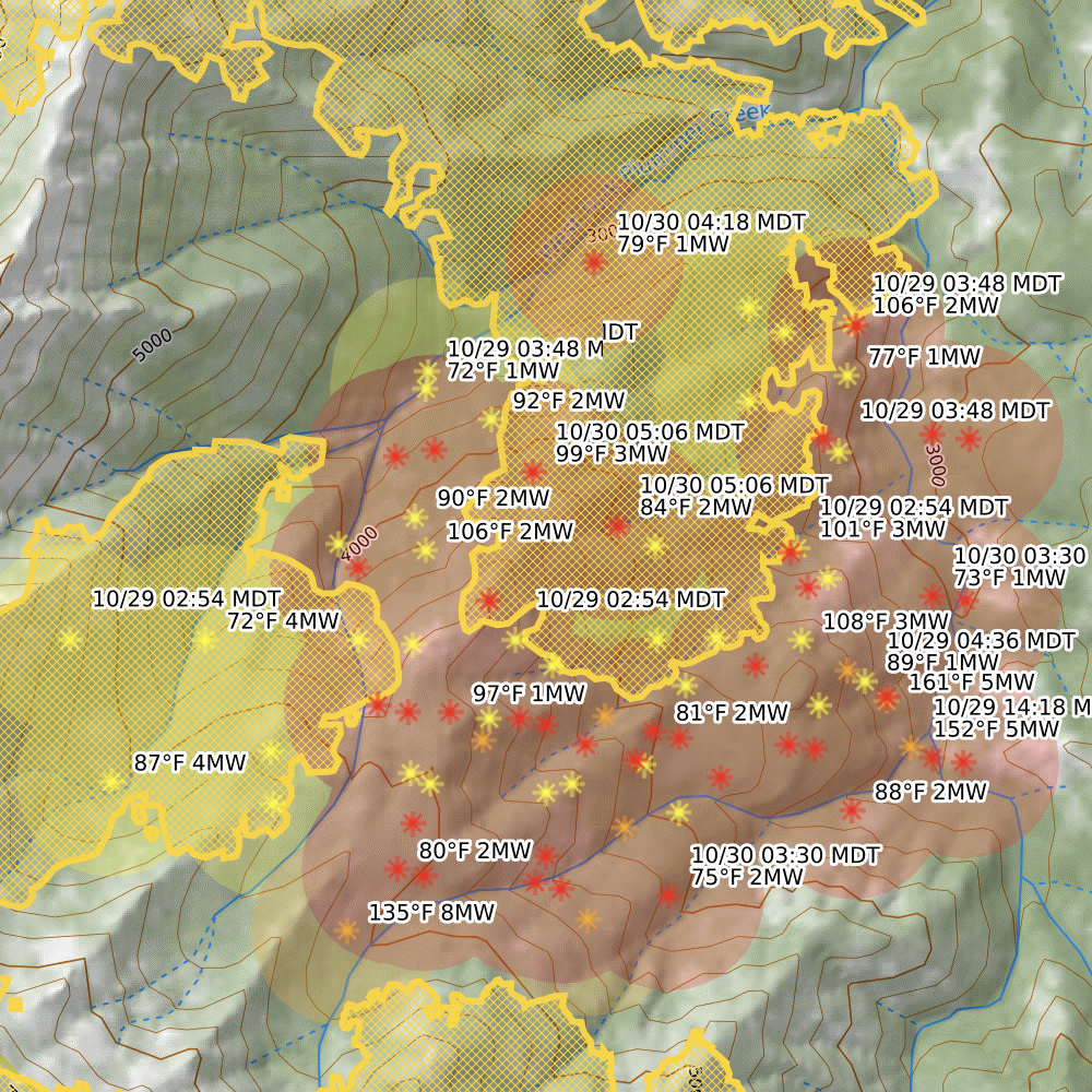
Fire Activity
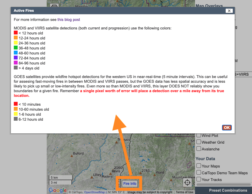
For an extensive explanation of the CalTopo Fire layers, go to this Resource Page.
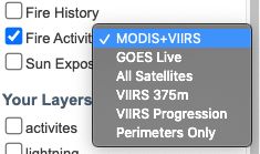
CalTopo’s Fire Activity overlay combines data from 4 main sources: three satellite platforms, MODIS, VIIRS, and GOES, and the National Interagency Fire Center.
There is a drop down menu for the Current Fire Activity overlay that allows selection from MODIS and VIIRS, GOES Live, All Satellites, VIIRS 375m, VIIRS Progression, and Perimeters. Each option provides a slightly different dataset or view. As you zoom in on maps additional information is revealed.
To see a color key for the fire activity layers, click on the Fire Info button at the bottom-center of the map viewer.
Display Options:
- MODIS and VIIRS: Satellite hotspot detections and perimeters.
- GOES Live:Low resolution, frequently updated large and hot fires.
- All Satellites: Display both VIIRS and MODIS detections, plus GOES Live and perimeters.
- VIIRS 375m: VIIRS only, adding temperature and power of hotspots.
- VIIRS Progression: Shows the changes and movement of the fire hot spots over time. Key is in the Fire Info link.
- Perimeters Only: Won’t show hot spots, but only the fire perimeter.
Remote fire detection is a complex science and can be difficult to interpret, especially if you or your property are threatened by fire. We provide more information on this overlay and the data behind it in this Resource Page.
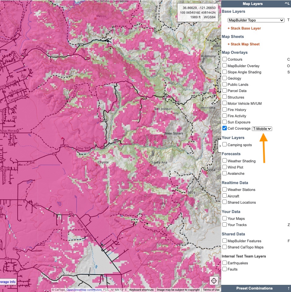
Cell Coverage
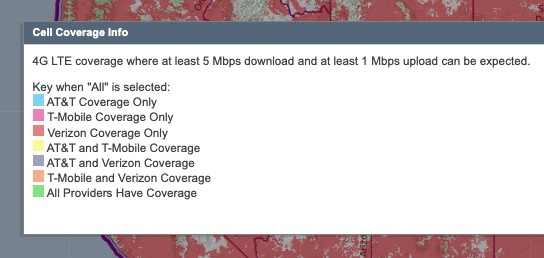
This layer shows cell coverage for AT&T, T-Mobile and Verizon in the continental United States. Data comes from the Federal Communications Commision Mobile LTE Coverage Map. Areas with 4G LTE broadband service at a minimum user download speed of 5 megabits per second and a user upload speed of 1 megabit per second are shown.
By default, coverage for all three providers (AT&T, T-Mobile and Verizon) is displayed. Use the dropdown menu to view coverage for a specific provider. To see a color key for which provider or provider(s) are indicated by each color, click the Cell Coverage Info button at the bottom of the map viewer on the web.
Your Data
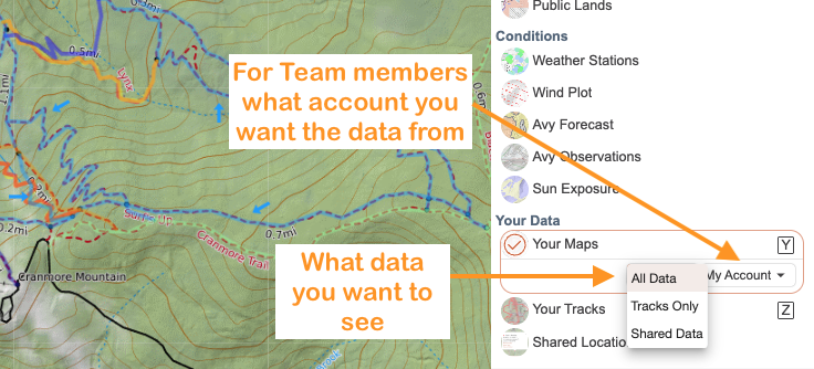
Your Maps
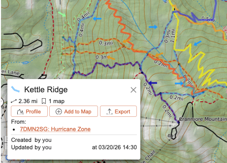
This overlay displays map objects from all of the saved maps in your individual account and your team account (if you belong to a team). Objects are displayed in different colors to help distinguish between them; the colors themselves do not convey any specific meaning.
You can choose to display all maps across your various accounts, or filter to show only maps in your individual account or in a specific team account. You can also filter to display only tracks by selecting Tracks Only, or display only your public maps using the Shared Maps option in the dropdown menu. Note that the Tracks filter only displays tracks saved to one of your maps — it does not display tracks stored only in your account. To view those, use the Your Tracks overlay.
Clicking an overlay object opens the details panel, which includes:
- Map name and ID – shown as a link that opens the map in a new tab.
- Distance and time/date recorded – displayed as applicable for the object.
- Add to current map – add only that object to your map.
- Export – export the object as a file.
- Elevation profile – view an elevation profile for lines and tracks.
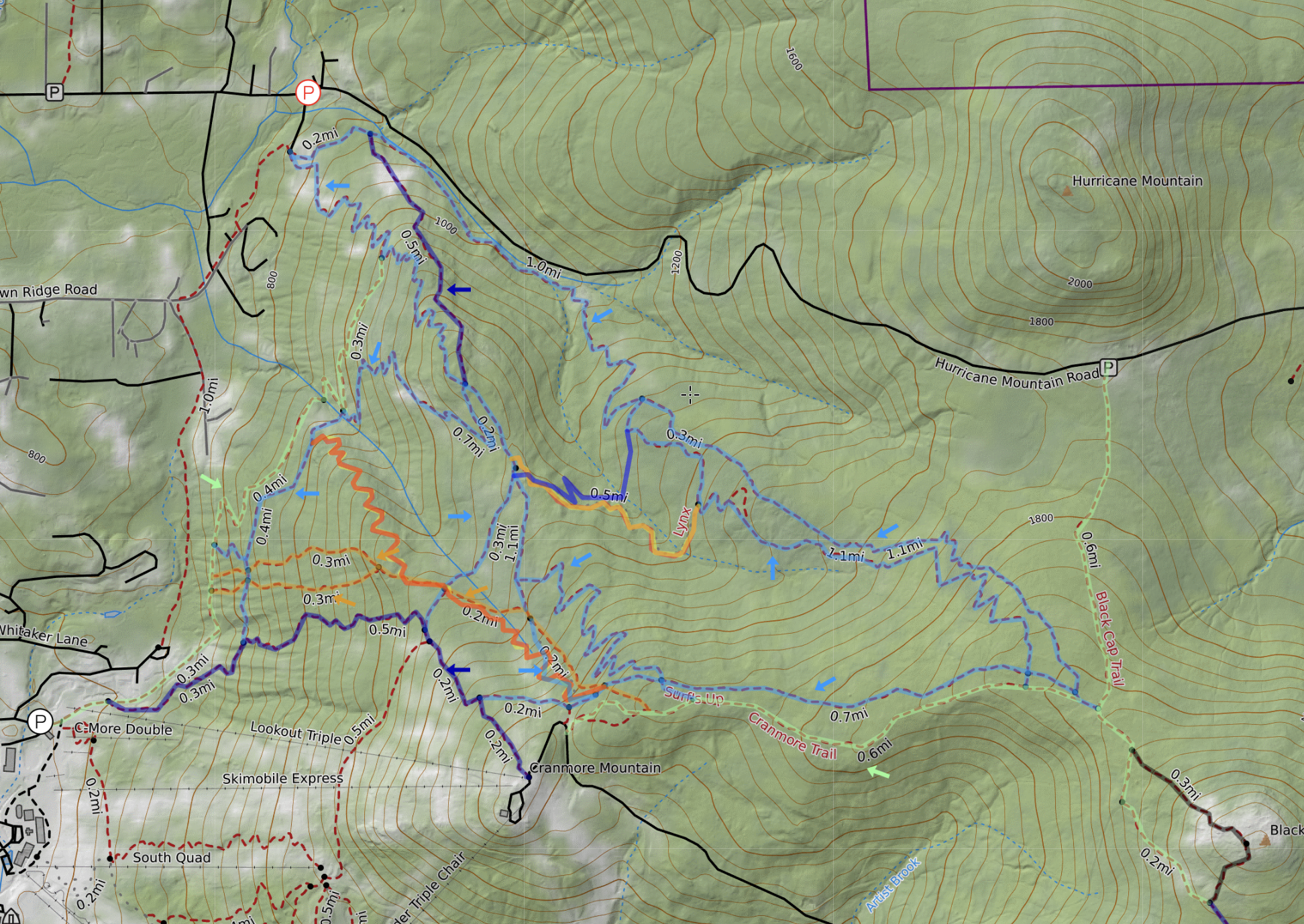
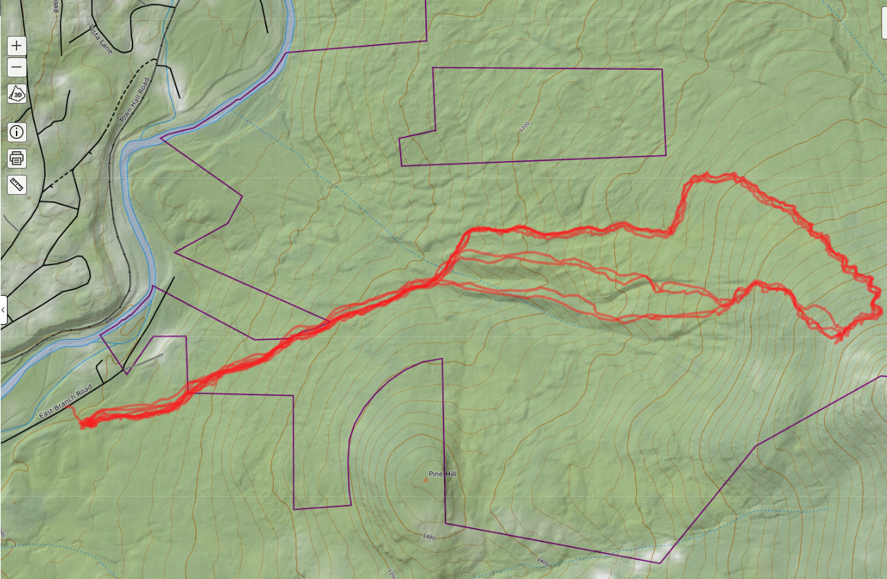
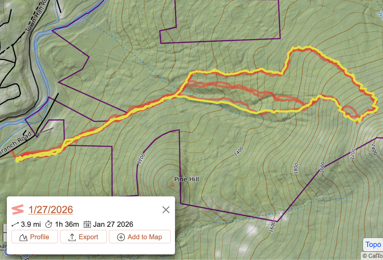
Your Tracks
Tracks you record in the mobile app (including those that are saved to a map and those that are only saved to your account) are added to Your Tracks automatically. This overlay allows you to view all of those tracks over the current map. These saved tracks will appear as semi-transparent red overlay in the Map Viewer. Clicking on a track in the overlay will open a box with information about the track including the distance, date recorded, a link to view the track profile, and a link to add the track to the current map.