Fire Layers Information
introduction
Updated July 2026.
First and foremost: If you’re in an area near a wildfire, follow your local authorities for evacuation notices and up-to-the-minute information.
While maps provide valuable insights into fire behavior and areas affected, a map is always just a representation of the best available data. Sometimes data is delayed or erroneous. Above all things, please stay safe and healthy.
With the increase in wildfires across the Western US, we’ve seen a huge spike in usage on CalTopo as well as numerous questions.
This page contains a LOT of information about imaging, data sources, and methods so read on!
Topics on this Page:
The quick and dirty:
- Fire activity overlays show fire activity on top of base maps.
- MODIS and VIIRS and Perimeters are the most accurate, but slightly older data.
- GOES Detections has less accuracy but is very up-to-the-minute.
- Pro base layers Sentinel Weekly and GOES Live provide imagery data.
- Fire history is usually not updated until it becomes available from the NIFC (usually sometime after the new year for the previous year).
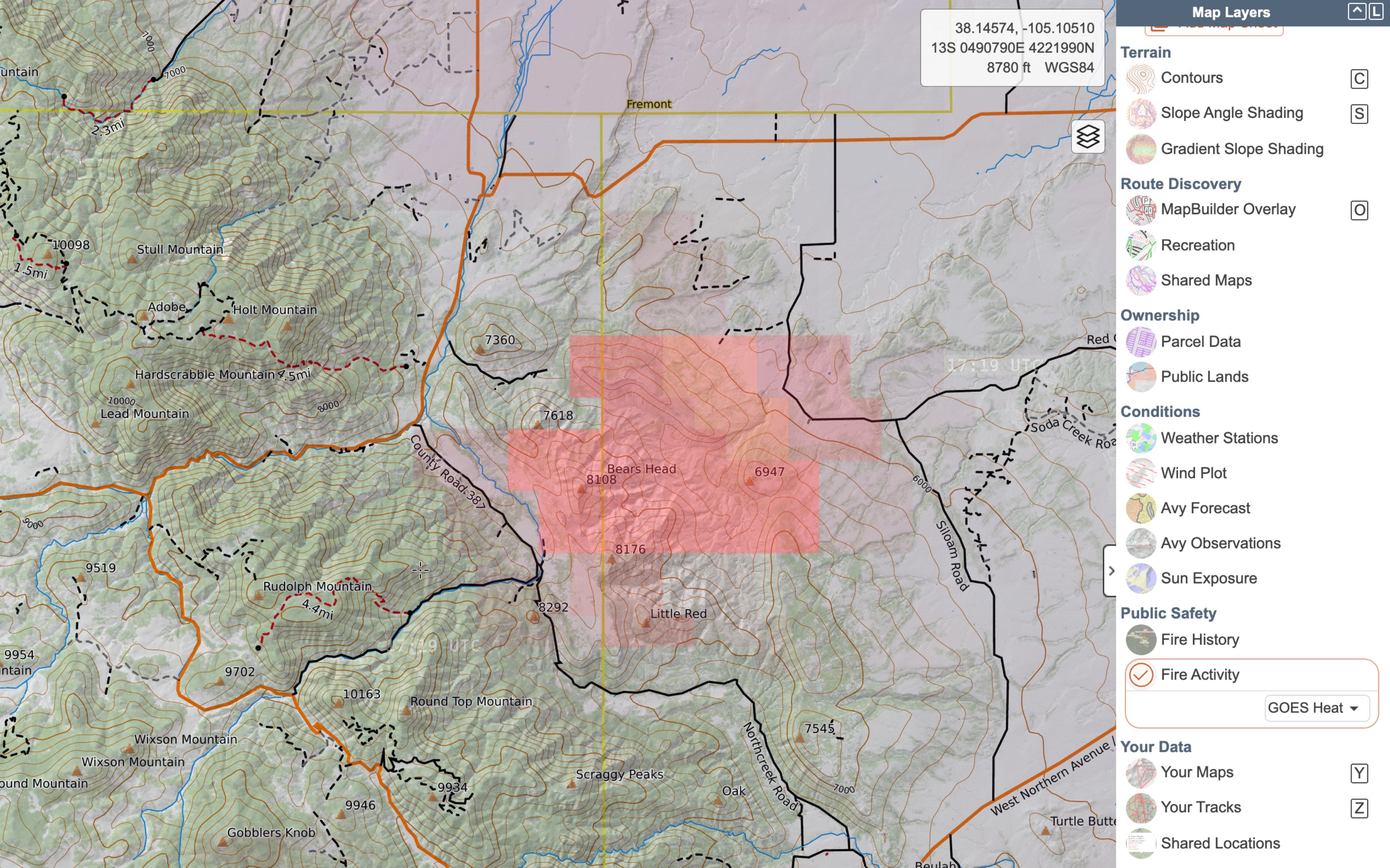
- If you don't see a layer in your Map Layers list, select the gear icon at the top of the Map Layers menu to open up the Layer Catalog. Find and turn on the layer to add it to your list.
Fire data generally comes from satellite sources to provide data in near real-time. The more "real time" that the data is, the less accurate it is.
To say that again - the more often the data updates, the less reliable it is as to where that fire is at on the ground.
Introduction to CalTopo Fire Data
CalTopo aggregates data from a large number of sources that provide insights for fire fighters, fire managers, and the general public. These features have been added over the years, unfortunately usually as a result of fire activity.
Below we’ll take a look at the different types of fire data available in CalTopo, and pluses and minuses are inherent in each.
Some things to keep in mind when looking at this satellite data: Some satellites stay in the same place above the earth at all times (geostationary), while others orbit the earth continuously. For all of the satellites, the angle from which they are viewing the earth ranges from straight above to somewhat oblique (off to the side.)
For example, if the satellite passes straight over San Francisco, but is recording data from 150 miles to the east and west of its location, then data it is picking up from Lake Tahoe is at an oblique angle. This can result in fire detection being perceived in a different place than it actually is at, show the wrong intensity, or just miss a spot because it's hidden by a steep mountain. However, a lot of smart people have worked on this and have developed algorithms to mitigate this known potential for error, so the data is still remarkably accurate.
Fire Activity Overlay
CalTopo’s Fire Activity overlay combines data from 4 main sources: three satellite platforms, MODIS, VIIRS, and GOES, and the National Interagency Fire Center.
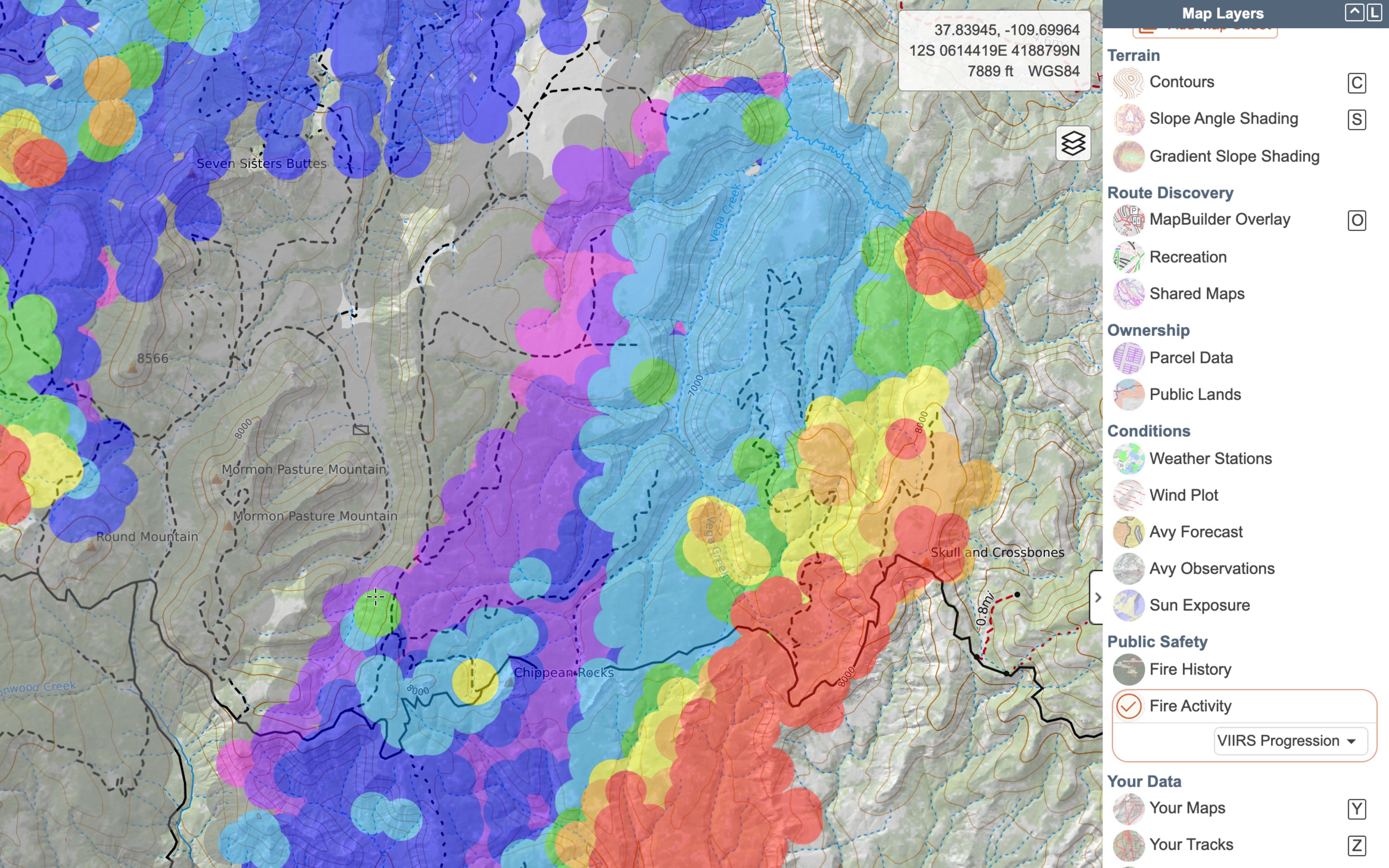
There is a drop down menu for the Current Fire Activity overlay that allows selection from MODIS and VIIRS, GOES Heat and GOES Detections, All Satellites, VIIRS 375m, VIIRS Progression, and Perimeters. Each option provides a slightly different dataset or view. As you zoom in on maps additional information is revealed.
MODIS and VIIRS
The MODIS program consists of two satellites, Aqua and Terra, that pass around the Earth, covering the entire Earth at least once every 24hrs. MODIS satellites have a nominal resolution of 1km, which means that they can differentiate down to a 1km square but within that km x km box the satellite cannot further differentiate where heat and/or smoke are. Furthermore, that resolution is only when the satellite is "looking straight down." At the edges of the satellite's view path, the resolution will be less.
The VIIRS program has a nominal resolution of 375m. Similar to MODIS, it provides multiple passes around the Earth every 24hrs with several satellites and is a major part of the current fire activity layer.
MODIS and VIIRS combined data are the default option in the Fire Activity overlay and are displayed on the map together. They are also part of the “all satellites” option. VIIRS can be displayed alone, or as a progression over time, allowing you to see how the fire has progressed.
Note that a satellite has to pick up the hot spot, the image needs to be processed and then the data has to be pushed out publicly for a fire to appear on our maps. When fires start quickly and spread rapidly, we can see delays of 12+ hours after starting before fires would appear in mapping. Fires can start very rapidly and grow incredibly quickly and VIIRS and MODIS programs only pass over the Earth 1-2 times each day.
How it Works:
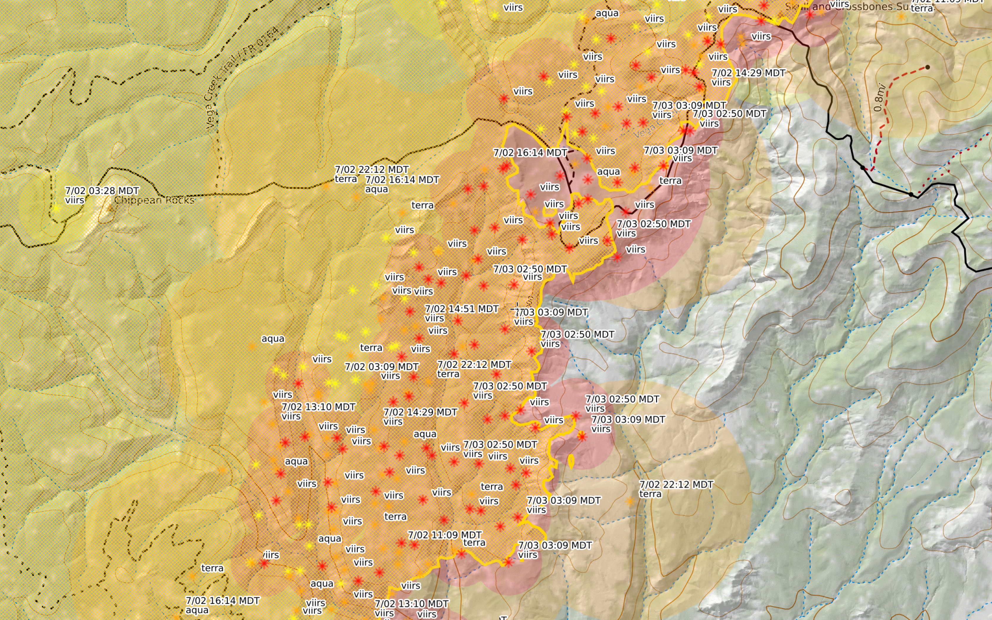
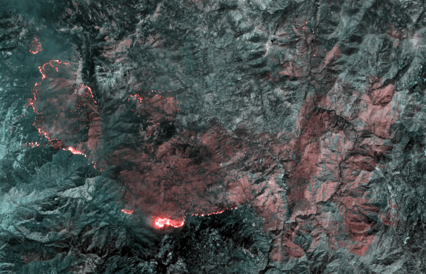
The infrared data from both MODIS and VIIRS contribute to hotspot detection, from which we can infer fire activity. As seen in the image above, the time and date of each hot spot along with the satellite that the data came from is always available.
Each hotspot also has an error radius around the point based upon error reporting from the satellites. The location of the satellite in relation to the Earth, as well as the resolution of the instruments on the satellites feeds these error circle. Finally each hotspot is color coded based on the time of the report. Red dots are most recent (less than 12 hours), then orange (12-24 hours), and finally yellow (24-48 hours). After 48 hours we remove the hotspots from the map.
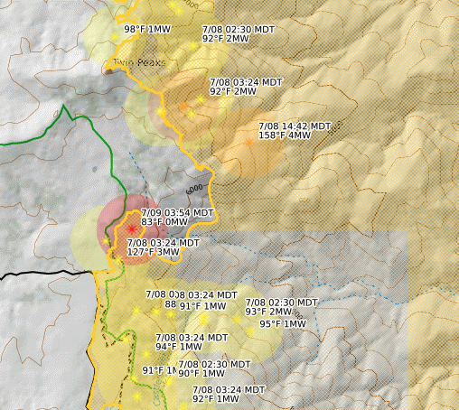
If you select just VIIRS 375m from the dropdown menu you’re also able to see temperature and power (measured in megawatts) of that data point. This is shown below.
The VIIRS progression layer shows a series of colored circles that help describe the progress of a fire over time. The data available in this layer goes back in time further than 48 hours as the other fire activity options do.With this, you can see rough changes in the day-to-day spread of the fire.
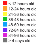
The same color scheme applies as for MODIS and VIIRS, but additional colors are added for more time frames. These can be viewed by clicking on the “Fire Info” button at the bottom-center of the map viewer.
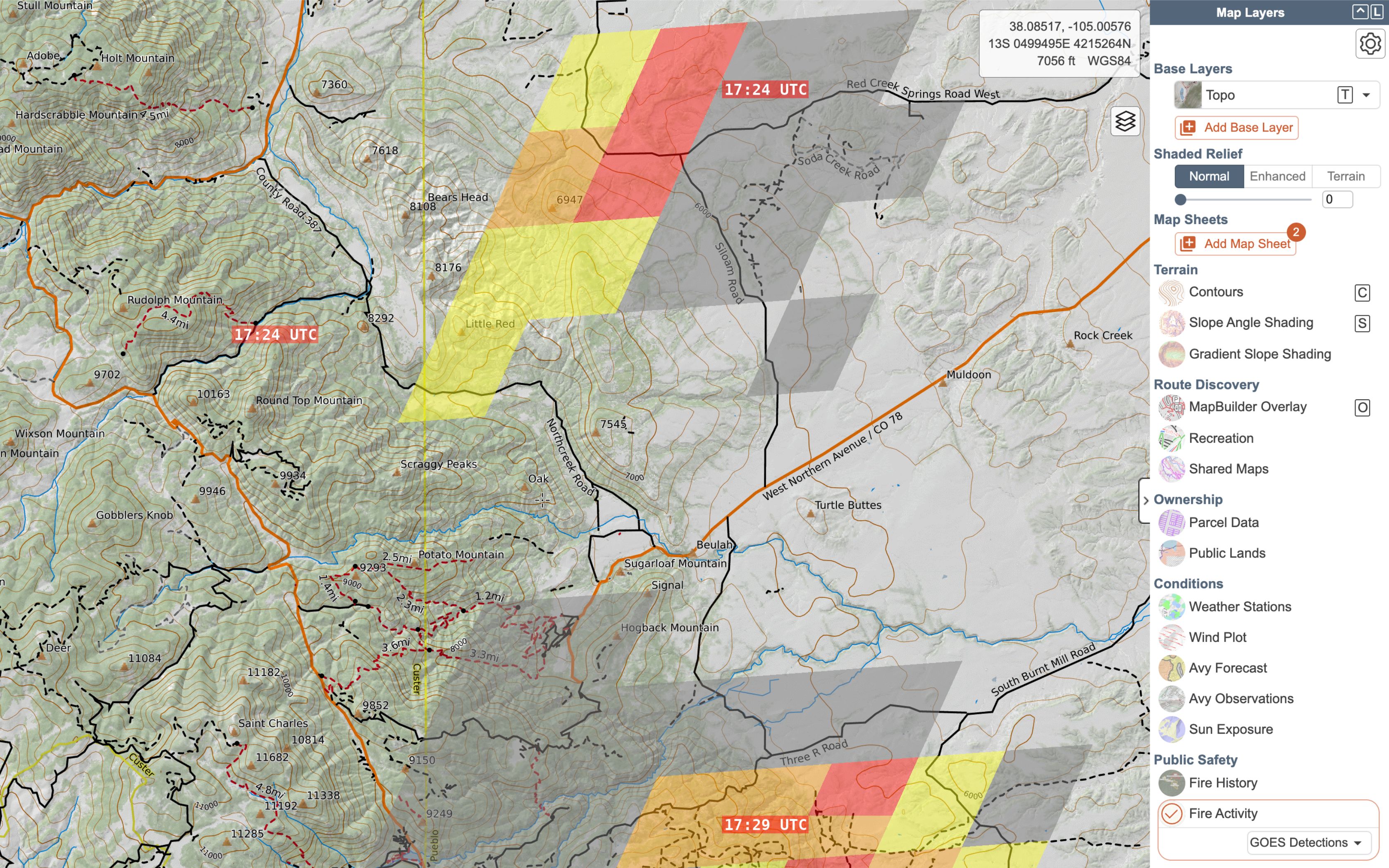
GOES Heat and GOES Detections
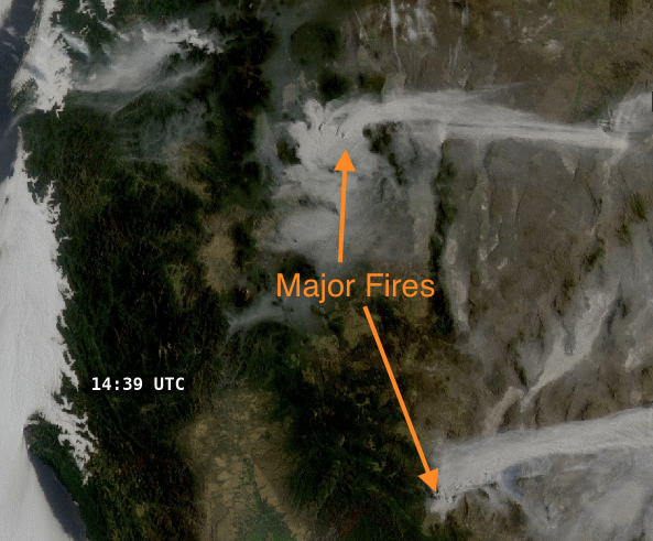
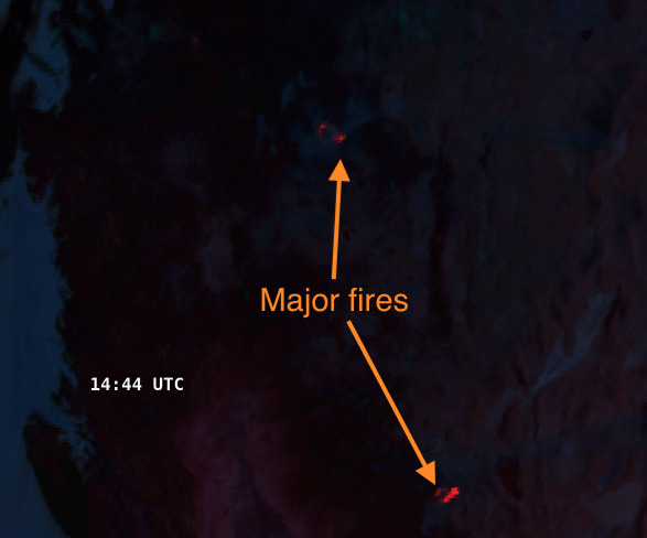
In 2020, as a response to the rapid spread rate of some California, Oregon, and Washington fires, we launched a new fire overlay: live fire detections from the GOES-16 and GOES-17 satellites.
GOES 16 and 17 are geostationary satellites positioned over the eastern US (16) and western US (17), streaming images back to Earth on a near-real-time basis. You’ve probably seen their imagery used for animated loops of hurricanes and other large-scale weather events. In addition to raw multi-spectral imagery, NOAA also releases a number of derived datasets, one of which is active fire detections. In the daytime, these fire detections are reported at 5 minute intervals.
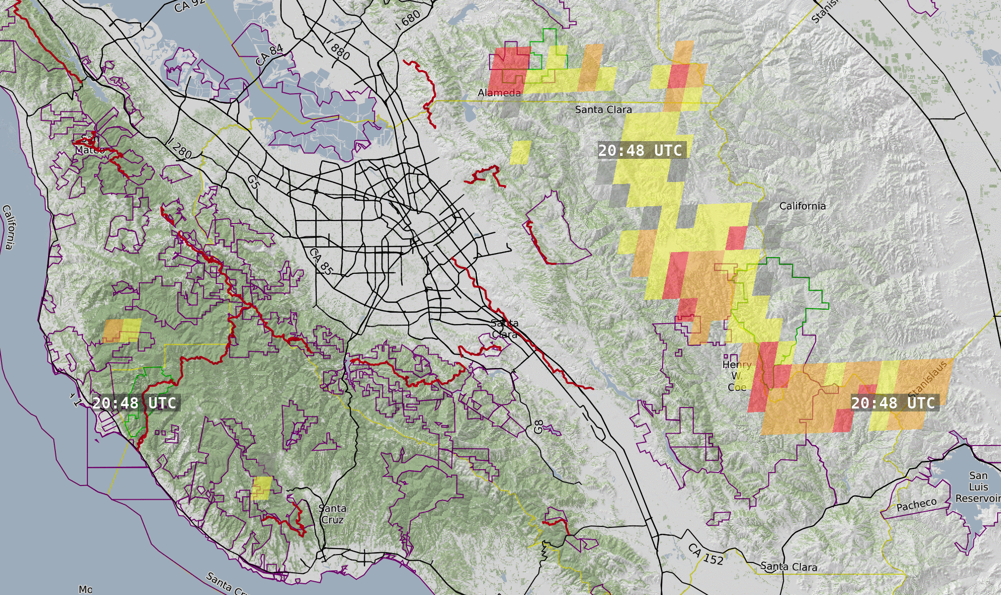
These overlays are good for determining a general area where a fire is active. They are NOT good for determining exactly where the fire is located on the ground.
Updates to these overlays are nearly live. The satellite has a rapid update interval of around 5-8 minutes, and the CalTopo map layer will auto-refresh to ensure you are always looking at the most current information. The time of the last satellite image is displayed on the layer. For new and/or rapidly moving fires, this can be useful information to supplement the MODIS and VIIRS satellite passes.
HOWEVER, each pixel is roughly 2km by 2km, so the layer will only show larger fire activity. And an error of a single pixel is enough to place a fire over a mile off from its true location – this is not a layer that will give you insight down to the level of whether a specific neighborhood has burned. The All Satellites, MODIS+VIIRS, and Perimeter options are somewhat better for that use case.
With any satellite-derived sources for fire detection, the data is a very imprecise tool that only reports approximate locations. It is easy to over-interpret these overlays as having more precision than they do.
GOES Heat displays data representing temperature observations. For those with Pro subscriptions or higher, this is the same data as the "GOES Temperature" base layer, but for the overlay we display relative heat and filter out the lower temperatures. Because of some nuance in the presentation of data, the useable resolution for this overlay can be a bit higher than the absolute resolution.
GOES Detections shows large pixels indicating that the satellite has detected a hot spot. The different colors indicate time rather than temperature. This is a good overlay to use to see an overview of fire behavior and where it is moving over a few hours.
Please note: if you don't see anything in the GOES Detections overlay in an area with a known fire, that does not necessarily indicate that the overlay isn't working or that the fire is out. It simply indicates that the satellite has not detected any spots that are hot enough to show up in the overlay at that time.
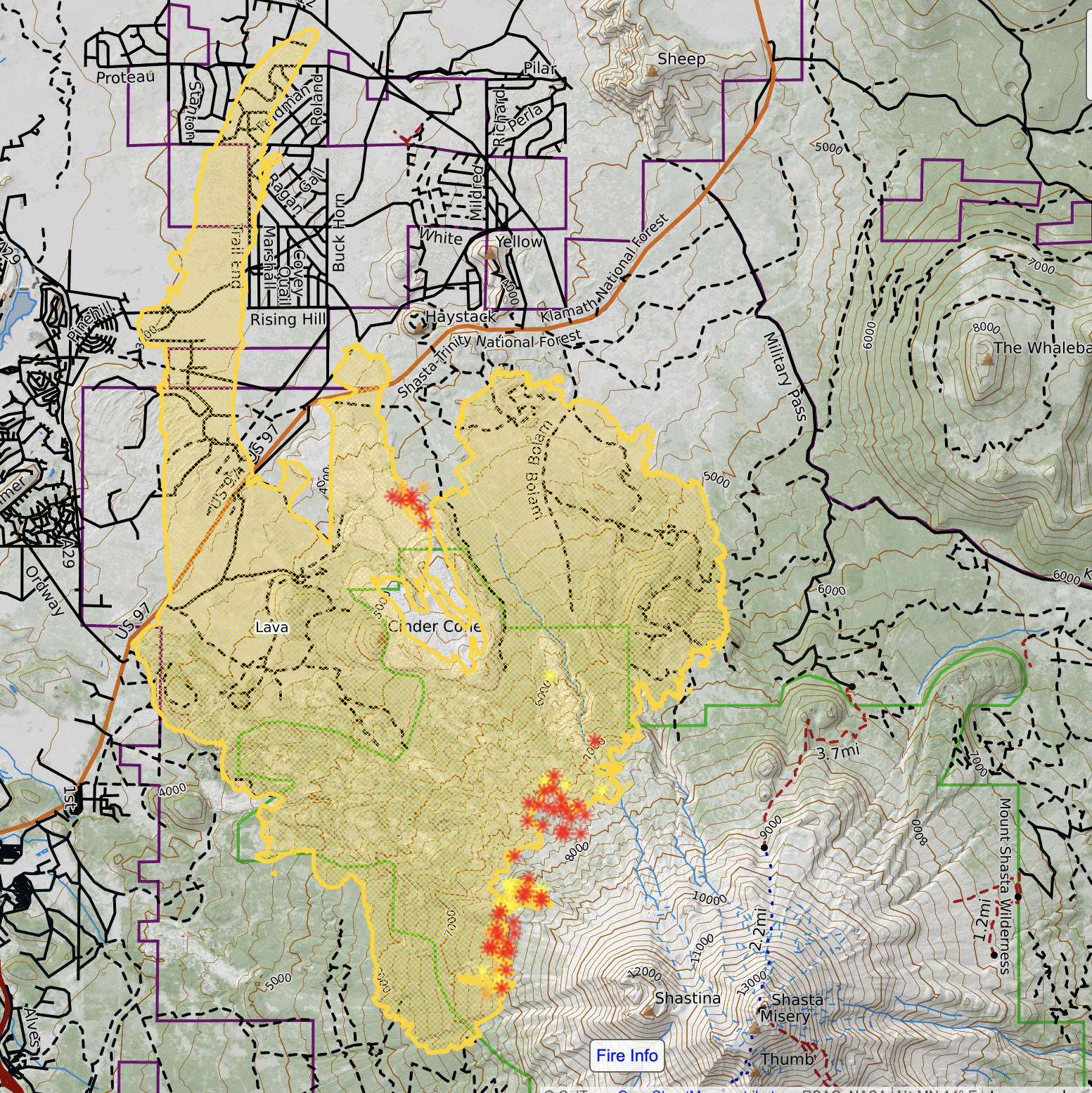
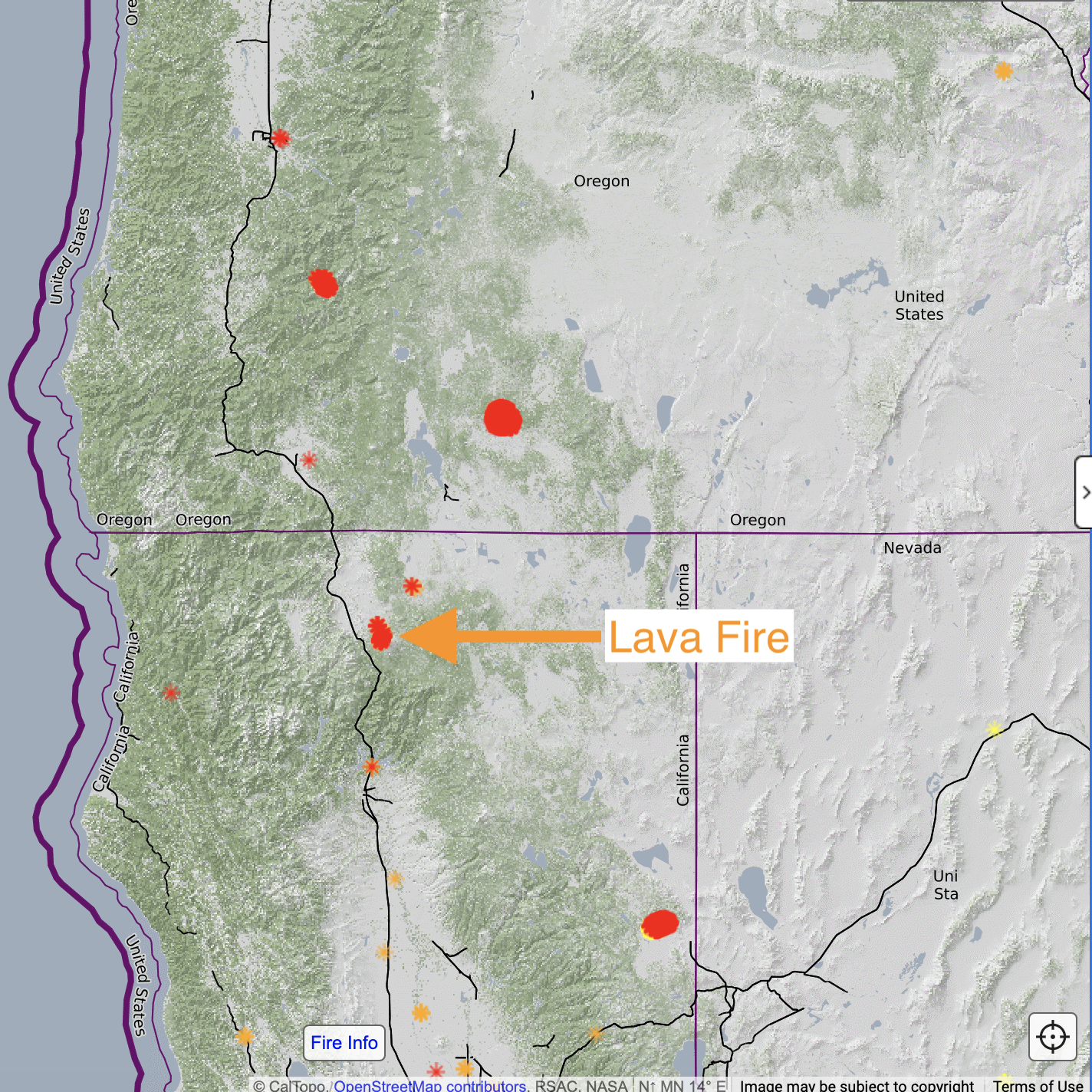
Fire Perimeters
Additionally, we display the active fire perimeter from the National Interagency Fire Center (formerly GeoMAC) on all the satellite views. These perimeters typically are updated once daily and come directly from incident management teams at the scene of the fire. They are based on a combination of reports from fire crews, satellite information and fire aircraft doing infrared flights or firefighting.
The fire name is displayed on the perimeter polygon. This is shown below with the perimeters for the Lava Fire in Northern California (below left). When zoomed further out (zoom 7 and lower) these perimeters disappear.
Fire-Related Base Layers: Live Satellites
While the fire activity and fire history layers described above display on top of other layers, base layers are images that cover the entire landscape. Our pro live satellite layers offer an additional source for fire-related data. The pro live satellite layers are MODIS daily, Sentinel Weekly, and GOES Live including GOES Temperature.
For fire, we typically focus on the layers Sentinel Weekly True-Color and False-color Burn, GOES Live, and GOES temperature.
Sentinel Weekly True-Color
Imagery from the Sentinel-2 satellite covers the entire earth from the same viewing angle every 5 days with a 10-m horizontal resolution. The date that the image was taken is displayed on the raw image, although you may have to zoom out a bit or pan around to find it. We don’t know precisely when the next image in your area will be taken, but it is typically within 5 days.
Sentinel Weekly False-color Burn
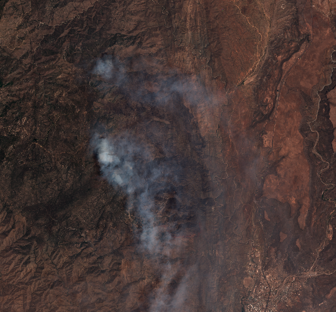
This layer is a false-color visualization based on the Sentinel Weekly high-resolution layer. By using Sentinel’s upper infrared bands, we discovered that we were able to provide a clear picture of burned areas and active hot spots, even when the visual imagery is entirely obscured by smoke. Keep in mind that this is a false color image based on infrared data, and the actual flames are not as visually intense as they appear. Sentinel imagery is updated approximately every 5 days.
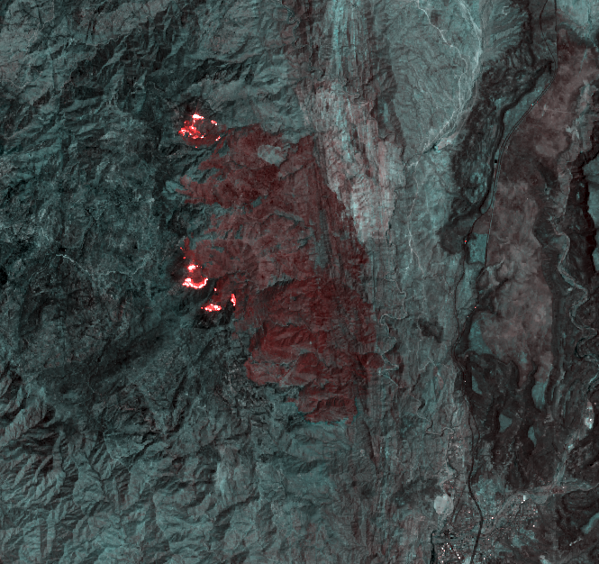
Below: The 2020 Castle Fire in California showing the difference in smoke between true color (left) and “false color burn” (right) imagery.
We know that when people are suddenly displaced from their homes, they are urgently seeking any information they can find. While this imagery does not have enough resolution to show the status of individual structures, we hope that it will help provide additional awareness.
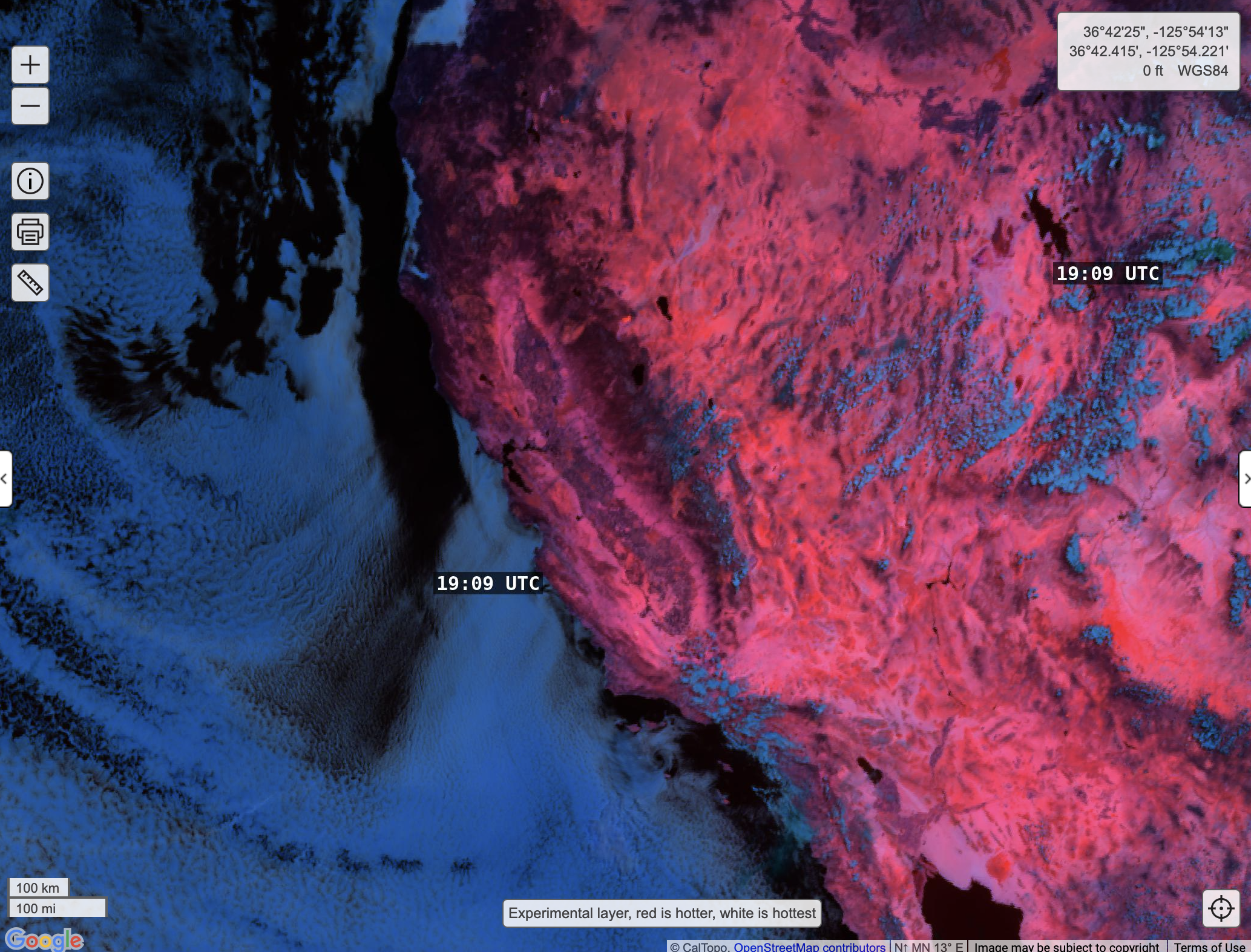
GOES Live and GOES Temperature
The resolution of the GOES Live and GOES Temperaure imagery is low, and the potential error is relatively high compared to Sentinel Weekly. However these layers are updated more frequently and can provide powerful insight into larger scale changes.
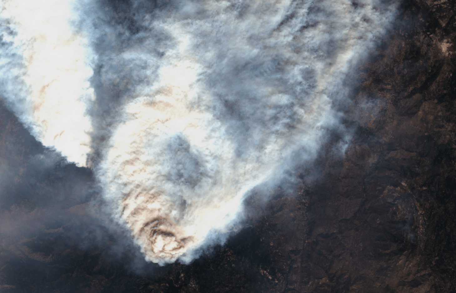
GOES Live is a moderate resolution visual image (it has a much better resolution than MODIS Daily, but not nearly the resolution of Sentinel). This layer lets you see large-scale meteorological changes, such as pyrocumulus clouds that have developed rapidly over large fires.
There is also a GOES Temperature layer alongside GOES Live. This false-color infrared image provides two benefits over the GOES Live fire detection layer: it can show fire intensity, and as with the visual GOES layer, it will let you see changes over time. GOES imagery is updated every 5 minutes. Take a look at GOES Temp for yourself.
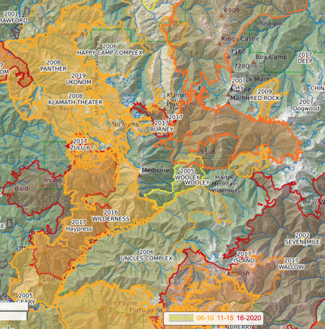
Fire History Overlay
Fires are mapped regularly throughout their progress and a perimeter is recorded. This process has relatively high accuracy. It is often done by low-flying aircraft or sometimes by fire personnel on the ground.
As you read above, there are active perimeters during the fire. Later, a final perimeter goes into a database that stores each fire for a particular year. When the yearly database of fire polygons from the NIFC becomes available, we bring that in and add it to the fire history layer.
We then color code the perimeter data based on the year, with red being the most recent (2016-2020 currently), and going backwards, lighter colors are earlier time frames. We include fire perimeters starting from 2000.
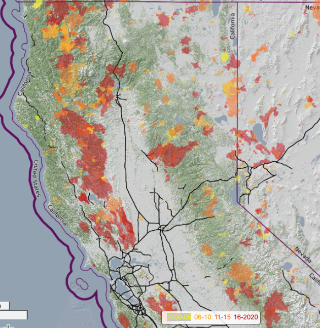
Sometimes, a fire does not get added to the database that we pull the data from, or it takes a long time to get a complete database because there were so many large and complicated fires in that year (:cough:, 2020, :cough:.) In those cases, data might be missing from CalTopo for a while.
Other Layers to Integrate for Fire Use
There are a few other overlays available in CalTopo that can help inform you about active fire behavior.
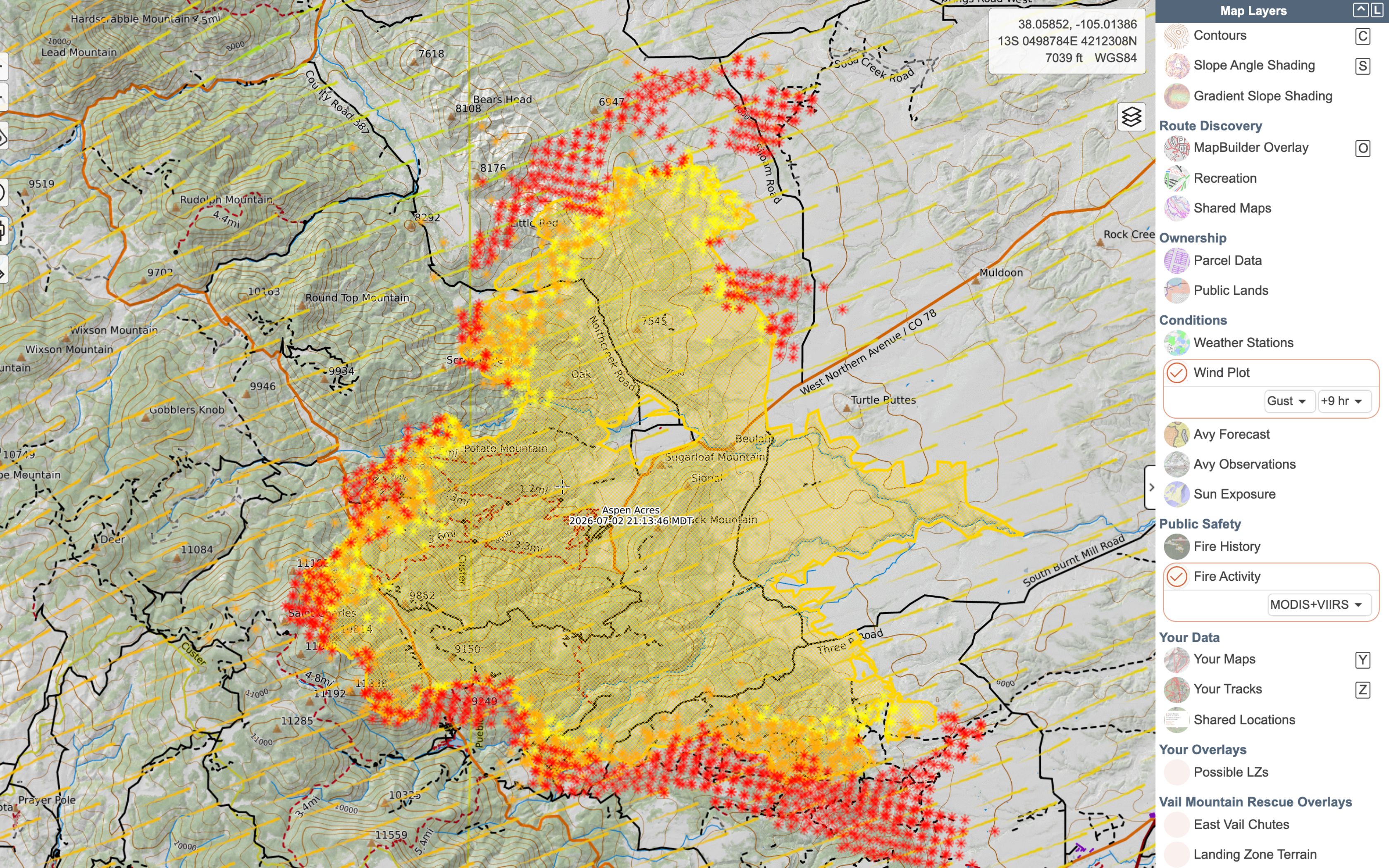
Wind Plot
Wind plot is one of the more powerful tools. With this overlay, you can view the current and predicted wind speeds and direction over the active fire. While this is based on data from NOAA, it cannot predict how the fire itself will change or amplify the wind pattern, as wildfires are well known for creating their own weather.
The wind plot shows current wind direction (indicated by comet-like arrows where the head of the comet means the wind is heading in that direction) and speed (indicated by color with a legend at the bottom of the page). This overlay is editable in that you can select the speed or gust forecast, and how far in the future to display the forecast.
The wind plot may help warn of future fire impact and extreme growth potential.
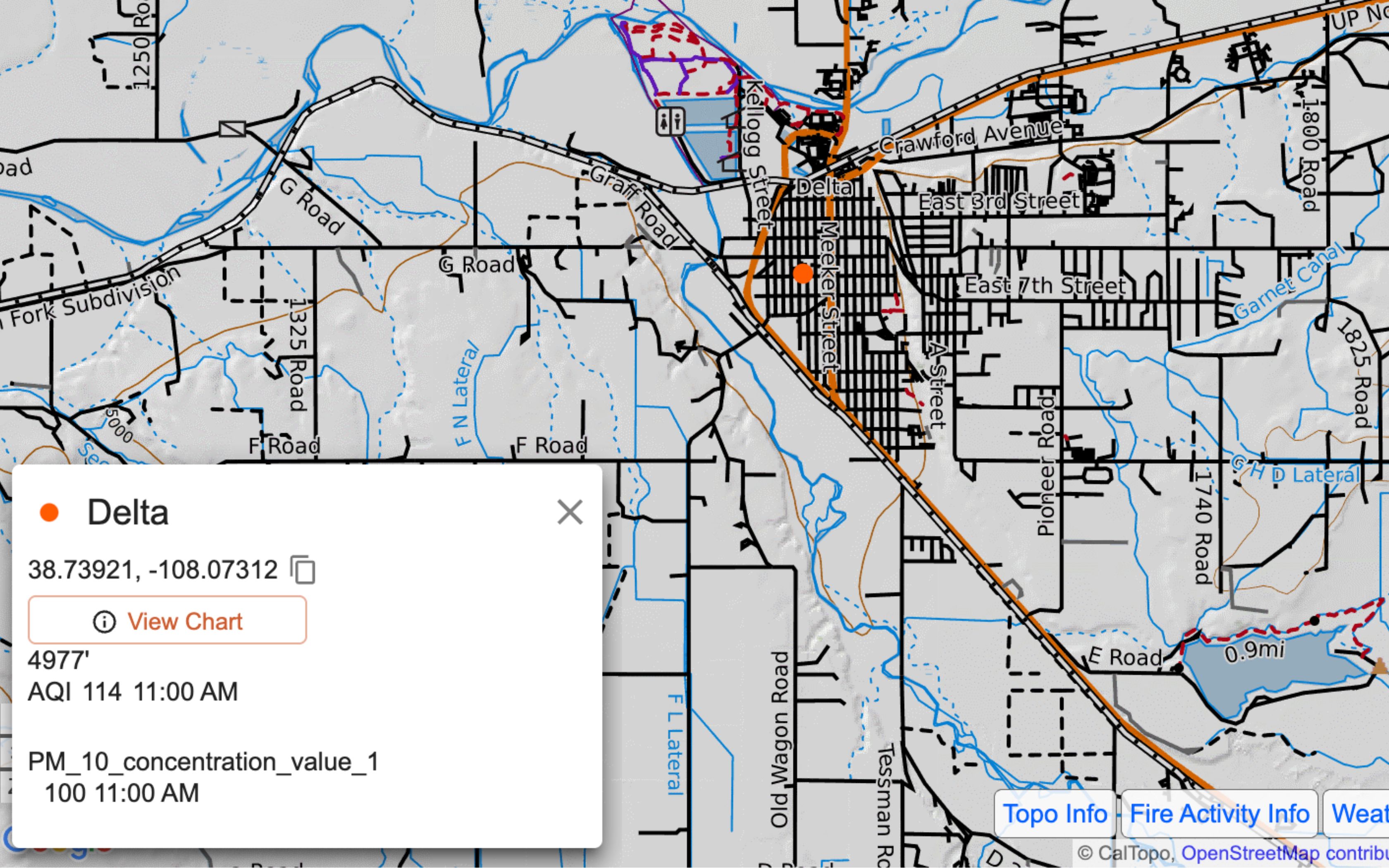
Air Quality
Another useful pro overlay is weather stations, which includes an option to display air quality index (AQI) data. Combining this overlay with other fire layers, such as live satellite imagery and wind plot, can allow you to identify areas that are currently being impacted by smoke from an active fire.
Stations and sensors that measure and report AQI data are indicated by a colored dot on the map, which corresponds to the most recent air quality reading. You can also display a customizable chart of the 7-day sensor history to further examine how the AQI may have recently changed.
Conclusion
There are a variety of other data sources to inform decision making about fires. Local sheriffs’ offices, fire departments, and emergency management agencies provide a huge amount of information about fires nearby, and are proactive with pre-evacuation notices and evacuation notices.
Additionally, InciWeb is a huge source of information with contact numbers, resources, fire size, containment, and evacuations. The National Interagency Fire Center (NIFC) provides more general wildfire information and has links back to inciweb for further details about specific fires.